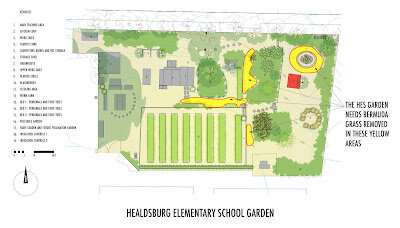
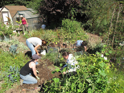
The Healdsburg Elementary School Garden by Michael Cobb

Healdsburg Elementary School boasts one of the longest standing gardens of any elementary public school in the Healdsburg Area (not to mention high schools and junior highs).   At the present time the school's parents are doing the least expensive (yet very effective) thing that can be done to improve a community garden: Weeding.  As a designer I want to believe there are planning ideas that can be introduced here that would significantly improve the garden for the children.  It is easy to imagine there are ideas that "crack the code" of the garden's challenges.  

There is no code to weeding except perhaps Teacher Vikki's cautionary: "Don't puncture the irrigation line with the spade fork."  

The reality of a successful contribution, however modest, is just as often the simple act of documenting any productive idea in a way that allows people to work shoulder to shoulder on a shared cause.  This is probably not why many go into architecture but it is one worthy undertaking of the profession that is under-represented.  Samuel Mockabee's work is certainly a testament to tapping a collective need that can travel under the popular radar.  

It is true that when you illustrate a new idea in a way that people find provocative there is a kind of alchemy that comes from the raw materials and people's labor that borders on miraculous.   But just as often architect's are capable of introducing ideas that, however interesting, are out of step with the milieu for which they are being proposed.  This can result in a lot of waste and it is probably one reason why the peace corp makes it a motto to not introduce new technologies to the cultures in which they work.  In this sense good architectural ideas are conjured equally from pure creativity and the simple habituation of the architect to the community's needs. 

 Comparing Samuel Mockabee's approach to development in California, makes it painfully clear it is possible to go a whole lifetime here without ever working on an authentic need-based project.  This effort is something that requires intention apart from the effort involved in simply designing things.  Teacher Vikki's Garden at HES feels like the kind of work Samuel Mockabee would be proud of.


Bike Shed by Michael Cobb

Here is a design for a bike shed that I recently built to liberate our garage from six bicycles. To borrow a term from modern manufacturing, bicycles aren't good at "nesting" with the orthogonal geometry that is so prevalent in a garage.  Common spatial conflicts arise between bikes and shelving, washer and dryers and boxes etc.

Also, as a transportation vehicle, the bicycle wants to be easily deployed and, in our case, moving the location of bike storage closer to the front of the property (our garage is in the backyard) made a lot of sense.  There is nothing more frustrating than moving stuff out of the way when you want to get to a transportation vehicle.   The thing should be able to move immediately.  It's accessibility is part of its function.

Roughly 14 feet long, this bike shed has two bays, one per each rolling door.  You can also just as easily use one bay for your yardwaste, trash and recycling trifecta.

It turns out Metal Sales (the corrugated metal supplier) can ship its panels in 1/8" lengths so to keep my own labor down and to avoid making the backyard a complete DMZ I shipped it this way.  The shed wasn't a big rush so I went ahead and framed it first to make doubly sure the lengths would be right on.  It was great to not have to hover over each panel with an abrasive blade.  I think my dog Blue appreciated that too.  I can't imagine NOT paying this minor premium.  It saved hours of time.

The roof is a very shallow 1/4:12 slope with a rubberized asphalt substrate that should be sufficient to keep things waterproof.  It will be interesting to see how it holds up.  A bike shed seemed like a good place to try it out and I wanted a slope that wouldn't rise up and disturb the neighbors with its height.  I also wanted something that shared the directionality and movement of the the horizontal corrugated siding.

After witnessing the sheet metal work done by roofing subs on a couple of our recent residential projects, this sheet metal work was the first chance I had to try our some of their techniques.  I think the biggest take away from watching how the pros do it is that you can really clean up the look of sheet metal if you understand how and when to use pop rivets.  There is really no better exposed fastener solution for corner flashing and trim than an exposed pop rivets.  It virtually disappears and, if you aren't fastening a big panel to the plywood substrate, there is usually no reason you can't use a rivet in lieu of a screw with a neoprene washer.

Last but not least, a big thank you to Dennis Furia of Furia Heating and Air Conditioning for supplying all the break metal on the job.  They did very accurate work.


Using Wood Milled On Site by Michael Cobb

Figure A
With all the talk about alternatives to wood in the construction world, it is worth noting that wood has several redeeming virtues.

1. It can be harvested locally.
2. It requires relatively little energy to transform the raw material into a building material.
3. It has an established track record with the building code.
4. Douglas Fir, the primary structural wood grown in California, grows relatively fast.
5. If push comes to shove, it can be used in virtually any capacity in a residential project (floor, wall, roof, cabinetry etc.).

Drew Maneuvering the Lumber
In these respects, wood is more readily available and, once obtained, more "adaptively reusable" than most other materials.  Because scrap wood often gets used for blocking, furring or any number of other miscellaneous secondary uses, its efficacy often goes unnoticed and under-appreciated by laypeople.  Most of the time the wood is hidden in the wall and out of sight.

A while back a client removed a couple trees on her property for construction and life-safety reasons.  We were working on a design for her residence at the time and it was a golden opportunity to get some great beams.  Merle Rueser is one of the last remaining sawyers in Sonoma County with a portable sawmill aand we had him come out to her site and convert the felled trees into lumber.

Merle Managing the Milling


It's important to keep in mind that there are many sizes of lumber that are not readily available through a lumberyard.  If you have the opportunity to have lumber milled on site, its a great opportunity to get some big beams that would be costly through a lumberyard.   We had the extra wood cut into wall boards for the residence's public spaces.

In the last couple weeks Chapman Construction attached the interior wall boards to the Agriboard panels and we can start to see how the site-milled Douglas Fir is doing (See figure A).  The 6x14 overhead beams were stamped by a lumber inspector prior to incorporation into the structural design.  This is the one hurdle that is required of site-milled lumber and one should anticipate an inspection to start at a few hundred dollars.  For a residence, most of this cost is manifest in the transportation time of the inspector and you can usually get a fair amount of wood inspected for close to the starting price.

Curves and Mythology by Michael Cobb

When asked to speak to our exit from the universe of faith into the age of enlightenment I once heard the California Poet, Gary Snyder say, "Who among us can explain how a telephone works?  We take that on faith right?"

In this way it can be said that mythology is alive and well...even in an age of "reason."

Similarly, when I find myself at work doing CADD drafting and I reach for the B Spline tool (the one that makes all the pretty smooth curves) I have often wondered exactly what it is I'm doing.  This tool, and the math associated with it, is the backbone of virtually every graphic application that does curves today.

What math is transpiring here?  It is interesting to note that you can't really make a circle with the B Spline tool without a lot of massaging.  Clearly, there are limitations that, as users of CADD software, we are confined by willingly the same way Frank Lloyd Wright frequently used multiples of a 30 degree angle because this was what his triangle possessed.  It is worth being conscious of this if one is a citizen of this CADD craft and for this reason I would recommend interested parties check out this link or this one.

Particularly the last link has a wonderfully intuitive illustration of how a B Spline is generated.

Doors and Walls by Michael Cobb

It is possible to imagine an architectural element that is both a door by virtue of its operability, and a wall by virtue of its scale.   When doors are enlarged to approach the scale of a wall we find spatial uses that, in the absence of this "Door/Wall", would have simply required more rooms.

Between the inside and the outside, large openings are a luxury most california homes may indulge in at minimal cost and great enhancement to  interior spaces.  They improve indoor air quality, natural light and views.  Used in conjunction with sun visors,  large openings are easily waterproofed and provide a mechanism for extending the living space into hospitable environs.

On Openings by Michael Cobb

Studio 711
In contemporary architectural design there is typically much attention given to the exterior massing of a buildings and this is a fundamental aspect of a building's experience.  But if one considers the inner life of a building, one realizes that the openings in a wall are frequently the most legible physical feature of the building itself and as I have continued to practice architecture, the significance of openings has become more pronounced.  Walls may be hung with art and obscured by furniture.  Floors way have similar occlusions.  Ceilings tend to be above the natural human field of view. But the opening, be it a window or a door, is implicitly a right of way for people, light, fresh air etc.  This attribute preserves an openings' visual clarity and as such, openings are deserving of esthetic attention.  By dint of their role, they will rarely be obscured by the "life" of the building.

Studio 711 Garage Door at Office

Implementing Building Integrated Photovoltaics by Michael Cobb

The concept of Building Integrated Photovoltaics (or BIPV) has been around for a while.  The idea behind BIPV is that an effort is made by the solar panel company to supply panels that don't look like an ugly after thought when placed on the roof or the wall of a structure.  For a long time arrays have often sat, somewhat insect-like, on the skin of a building.

Despite laudable efforts in the past decade, the problem of thinking about solar panels in a truly integrated way persists.  In short, it has just been very difficult to incorporate a mass produced mechanistic object into the esthetic fabric of the domestic environment.  Much of this can be blamed on the cultural schism that often exists between the worlds of architecture and engineering.

I've heard it said that good architects start off "knowing very little about many things until they know nothing about everything."  Good engineers, by contrast, are suppose to "know a great deal about very little, until they know everything about nothing."

This is a basic difference between the two disciplines and photovoltaic solar panels were conceived by engineers with the initial specific goal of providing solar power.  This undertaking required a great deal of expertise and specialization.

In the world of architecture, on the other hand, every building element is commonly asked to have "stacked" functions.  In other words, one building element should perform many functions.  This is not always true, and one can argue that the world of architecture is becoming increasingly engineering oriented.   Buildings are increasingly populated with elements that perform discrete functions. Not too long ago a wood floor simply sat on floor joists and performed the "stacked" functions of structural element, insulation, moisture retarder and finished floor etc.  This way of stacking functions has an efficiency about it that is wholly different from the efficiency of the engineering world.  The engineered solution tends to introduce specialized elements that address the individual design challenges; plywood subfloors perform the structural task, a finished wood floor for esthetic and wear issues and to protect the subfloor from wear and tear, and a possible vapor retarder between or under these two elements if one is specifically concerned about moisture.

This subject of "general" versus "specialized" design approaches is an intriguing one.  The environmental design movement today is taking a decidedly "specialized" approach vis a vis the LEED rating system.  This "point" system  is very much an engineering approach to the business of environmental stewardship and it can be argued that this specialized way of addressing our environmental problems is exactly what got us into this environmental mess in the first place.  After all, some of the most wasteful design solutions are the ones that, while efficiently executing their specific task, are inefficient in the breadth of their capabilities.

This project was intended to take the solar panel to a level beyond the BIPV approach.  We didn't want the solar panel integrated with the building only in the sense that it "plays nice."  On this project we wanted the solar panels to actively contribute to other functions on the project, namely to provide shade and a modicum of shelter.

If a pool is an ingredient of a project, it can be an organic place to utilize solar in this way since it gets good sun exposure and can benefit from an elevated structure that also provides a modicum of shade.   One sees this being done with carports as well and this is the strategy we implemented here.

The two biggest construction challenges with this installation were the wire management and getting all the team members to realize - conceptually -  that we weren't just installing solar panels; we were installing a shade structure.  

It turns out it is typical to install solar panels wires in a leap-frogging daisy chain fashion utilizing the wire whip that comes with the individual solar panel from the factory.  This practice avoids introducing an extraneous wire at the end of the run to bring the circuit back to the beginning.  This extra wire also adds a little cost and reduces the efficiency by a very minor amount.  But if you are making a shade structure and not just a photovoltaic array, this cost is minuscule compared with the cost of an entirely discrete trellis element.  This is exactly what we were trying to accomplish.  For this reason, Solarworks installed an extra circuit-completing cable (in addition to the whips provided by the factory) to keep the wire pattern consistent.  This strategy was facilitated by the presence of tube steel trellis members that provided a concealed manner for routing the wires as well as the mounting mechanism for the panels themselves.  A big thank you to Mark Rechin at Total Concepts for coordinating the final effort to fine tune this wiring issue.

figure 2
Left to their own devices, and in the absence of some clearly articulated alternate objective, any solar panel installer is going to install solar panels with about a 20° tilt at this latitude to maximize productivity.

These panels were installed with a 1/2" drop across their 5' length.  The reason for the minor tilt is to simply get standing water and grime off the panel and to prevent this scum from hampering energy production.  This array had two parallel rows of solar panels along its length and we simply pitched them to either side of the main axis with the peak running lengthwise down the array's ridge (see figure 2 and 3). The solar panels need to be cleaned with a hose once a year to maintain reasonable efficiency. 

figure 3


On this project we pursued a strong connection between the grape fields and the pool site work. The solar "trellis" was an element that was striking in its similarity in both form and function to the stakes and metal wires that supported the grapes and aided in their harvest.  This idea of harvesting energy became a strong force in designing this solar trellis and we wanted to create a real harmony between the geometry of the grape fields and the pool terrace with its solar-harvesting shade element.  We had wanted to design a building that had an authentic connection and harmony with its environment and this seemed like a strong way to pursue this connection.  A shade structure that was not pitched, but virtually flat, would resonate strongly with the layered planer geometry of the project (e.g. the pool surface, the terrace and the fields themselves).  It is true that there was a minor loss in power production associated with this strategy but in a more macroscopic sense for the project we had also built a shade structure where we could have simply built a solar array .  This is the basic idea behind building integrated photovoltaics.

I was happy to hear this week that the eight kilowatt solar panel array is currently running a credit with the electric company for the entire Diaz facility.  

My Father's Home in Willits by Michael Cobb

With the down turn in the economy there are understandably a lot of questions from potential clients about how to build things on a tight budget.  I frequently point them to a project done up in Willits for my father several years ago.

A lot is written about square footage cost.  This is a coefficient that can be readily applied to just about any project and because of this it is a popular way for people to get their head around building cost and compare relative costs.  But there are a lot of hidden costs to a project that are either included or not include in this figure depending on the point someone is trying to make and the nature of the building type.

In the residential world for example, when one speaks of the square footage cost of a home, one often takes the construction cost of the building itself and divides it by the heated space square footage.  The cost of the garage and the other "servant spaces" go along for the ride and contribute to the square footage cost of the residence proper.  To include square footage costs that are not actually the square foot in question often strikes people as odd.  This is understandable but it is important to realize people are trying to focus on the cost per square foot of living space with all the building related prerequisites.  Conversely it is quite typical (though not categorically so) to not include the cost of the sitework (driveway, utility trenching etc.). This is part of a civil engineering universe that usually doesn't apply to the construction cost of the home itself.  The whole thing can get quite convoluted.  

Having said all this, we did my fathers house for roughly $150 a square foot.  This was done back in the mid 90's.  Even back then, that number was eye-catchingly low for a custom residence.  I don't want to frame our solution as a recipe for how anyone can build a home for $150 a square foot.  The real answer is that you use all the resources you have at your disposal and you don't invest in anything that you don't deem necessary.  

Its important to realize that most spec homes are not built this way.  At least not this second criteria dealing with neccessity.  Why?  Because a spec home needs to appeal to a broad enough audience to stay marketable out of the gate and different people have surprising tolerances for inexpensive solutions.  They also want surprising amenities and I like to believe that you can build pretty affordably if you don't try and trick your house out with every amenity to a middle-of-the-bell-curve-or-greater extent.  

My father, for example, did not need a dishwasher, a door bell, an enclosed garage or a ducted forced air system.  His house was 900 square feet and a carport with a large closet was sufficient for his "garage" needs.  Because this two bedroom house is so small there is virtually no hallway.  Everything is built around a central music-making living room.  

We also went radically light on the floor.  Except in the bathroom and the kitchen (where we used linoleum) we used floor paint over his plywood subfloor.  We didn't put down any additional carpet or wood flooring down.  He uses area rugs. The outside of the house is simply painted exterior grade plywood siding with battens applied at 12" on center.  We debated the need for the battens but the fact is they help to conceal the nails and plywood joints.  Most custom homes these days add a layer of siding.

My father also hired a general contractor as the job foreman and took on the general contracting responsibilities himself.  This avoided the usual 15% to 20% markup.  I wouldn't recommend this approach for everyone.  He and I talked a lot and he was a conscientious presence on the site.  He is also someone who has gone all his life with little to no health insurance so he is use to avoiding the moral hazards associated with lots of liability protection.

On the flip side of things we invested in a couple things he really cared about.  He got a nice wood stove and a 24 gage painted corrugated metal roof that was expressed on the interior of the house as a vaulted ceiling.  Fine Homebuilding had an article several years ago that opined that a vaulted ceiling usually increases the building's typical square footage cost by 50% in that area.  Part of the reason for this is the expense usually associated with more complicated drywall installation or the finished lumber work involved with exposed beams. We tried to offset this tendency by simply using conventional framed lumber in the ceiling.  This included simply exposing the framing plywood.  But this roof was still expensive.  The insulation of a vaulted ceiling is typically complicated and this house was not exception.  We had to sandwich a layer of polyisocyanurate insulation on top of the interior plywood and a second layer of plywood to which the metal roof itself was attached.  At the end of it all he got a long lasting roof with good acoustics in the living room due to the high ceiling.  The clerestory windows also act as a cooling chimney for the house.

All in all the project was a study in surgically installing your wants and needs and dispensing with the unnecessary things.  In many ways this summarizes the undertaking of design.


The Interior Under Construction

CalGreen: The Pros and Cons of the New California Building Code. by Michael Cobb

After spending the day in seminars going over the new California CalGreen Code a while back, I feel I can finally shoot my mouth off a bit without feeling like I haven't "done my homework."  Here are my take away points from the new regs:

First let me say that getting a famously diverse state like California to march in lock step over building codes must be a daunting challenge for any codesmith.  The task boggles my mind.  Also, whether we like it or not, we have big appettites here in California.  We like our scenic highways, our beautiful real estate, our cuisine and our nice weather.  While we care about the environment, we also like our bonvivant lifestyle.  Its not exactly a state of deprivation.

Getting the code officials, let alone the construction industry to realize that environmental issues are also health and safety issues is a challenge I never thought would see the popular light of day.  Up until now I've had the sense the code was a life safety apparatus in the most blunt sense of the word.  It might waste tons of embodied energy in the name of lonely ADA bathrooms sprinkled across the US but at least at the point of use, the mission is clear.  Seeing a code with more big picture environmental concerns is a relief.  It might still be couched in self interested terms, but there is something laudable about treating the environment as something to be preserved.  So bravo on that.  This code is a big step toward recognizing in a conscious way, what many tribal people know intuitively: The environment is worthy of respect and - in some hard-to-define measure - our own well being (i.e. health and safety) is tied up in it.

Having said all that, there are a couple things that really rub the wrong way about this new code.  For now,  let me confine myself to the subject of fireplaces.

There are a lot of people who say they won't buy a house without a fireplace and yet it is ILLEGAL to build a house with a wood fireplace in modern California.  I get there is an indoor air quality issue.  I understand that wood smoke can dirty the air.  Nevertheless, this in itself is not a sufficient reason to outlaw open fires inside a home.  Burning wood has many benefits that driving a car or burning yard waste on burn day lack.  This is especially true in Rural areas. You are replacing the consumption of gas, oil or electric energy with a locally available - potentially FREE fuel that, among other things  - has the added benefit of clearing the underbrush in fire prone areas.

I get that there are certain areas with precipitous terrain or "dead air" that suffer inordinately from wood fires and it makes sense that these areas be considered too dense for fireplace use.  But it seems wrong that everyone should lack the option of a fireplace because of these areas.  We are not headed for the kind of congestion that merits a blanket code on this front.  Marc Reisner, the author of Cadilllac Dessert, would have us believe water usage will curtail growth long before fireplace pollution would have this effect.

The other reason that gets paraded around for public viewing when we talk about abolishing fireplaces is indoor air quality.  The dirty little secret that is implicit in this argument is the fact the code has been pushing the industry, wrongly in my opinion, toward more air tight construction for some time.  It is not without irony that buildings have also been having issues with mold in the past couple decades.  Even the requisite energy calcs mandated by the state of California completely neglect the reality of thermal mass in association with thermal comfort.  Objects (like fireplaces and concrete floors) allow heat to be dissipate over time in a manner that continues to function even when the doors are open or you are in a space with a high ceiling.  Objects with high thermal mass do this primarily by radiating heat via infra red radiation and conducting heat to the surrounding air.  Thermal mass located near the human body is a tremendously effective way to stay warm.

A complaint voiced about fireplaces has been the general draftiness and extremely local comfort afforded by their heat inside a house.  Like this is a big surprise?  Many people know that opening a window or door can help keep a fire going.  The fresh air is also good and, because the fire is a radiant heat source, this isn't, per se, a problem.  If you wanted to be warmer you had to "huddle" by the fire.  Because the code is only now becoming somewhat sensitive to thermal mass, the construction industry has been obsessed with heating the entire mass of air inside a house and then sealing up the house tightly in some kind of strange hoarding idea that should not be given more credence than some - arguably more valid -other ideas.  An equally valid instinct is this abiding "huddle" idea and it seems wrong this idea should be given so little validity when a more worthy goal would be to rectify this deficit in the virtues of a breezy house with high thermal mass in the present code.

Also, the fact that gas fireplaces and EPA approved wood stoves are allowed is suspicious.  All these appliances just seem to be a further step toward disposable materials that work out well for big business.  Gas fireplaces might burn efficiently at the point of use but there is no reliable way to quantify the embodied energy associated with the exploration, extraction, production, transport, storage and distribution of this fuel.  One thing is certain: It's a whole lot greater than a dead piece of wood.

Academics might attempt it, but the reality is: you and I will never know.  It bothers me that this form of fuel use is so causally detached from me.  The beauty of a fireplace is not only the way the flames can lick so deliciously at the dead wood but the fact that people understand it.  Too much smoke can make you choke.  There is no doubt about this.  But the fact you understand exactly what is polluting your environment has merits in itself.  It is too easy to displace the pollution to central locations where its effects go largely unnoticed or understood.  It seems better to regulate the usage of open fireplaces in a community-by-community way where the effects of usage patterns can be suitably addressed along side the obvious economic and larger environmental benefits of avoiding the use of a processed fuel source.

A Roof Under Spared Trees by Michael Cobb

Last week I visited a beautiful retreat called Four Springs in Middletown.  Their main lodge had recently burned down.  Based on the folks I spoke with, the lodge was a place of many memories and its lose will be something that will take some time to heal.  While the place clearly has its own ethos, it reminded me of several places I have visited in California as both a child and as an adult.

These retreats are literally what California poet Robinson Jeffers called "A roof under spared trees."  Something about this kind of place captures an enduring side of California life.  Tucked away in the forest, the retreat is a spiritual place with no discernible ambition to take its spirituality "on the road."  From all appearances what is taking place at this retreat is sustained largely on the power of the environment itself, both human and nonhuman. A worthy mode of operation.

Most of the cabins are simple and rudimentary in nature and serve mostly as sleeping quarters for the guests who gather at the lodge or other hubs located throughout the woods.  It has the effect of subduing the built environment while celebrating the natural beauty of the place.

Not all retreats are explicitly spiritual.  I can recall going to a retreat like this in the redwoods north of San Francisco as a kid and later as an adult my family and I journeyed to Camp Mather near Yosemite.  It is interesting to recall that a distinction of many early American protestant faiths was the concept of a meeting house.  This was  a radical departure from the more european catholic notion of a church and its designation as a "house of God."

As a child I remember being encouraged by many adults to acknowledge the beauty of nature as something spiritual and to be sure to get out "in it."  There was always this sense that if God could be found anywhere, the natural world was as good a place as any.  This early american idea that one did not need a cathedral or church to find God certainly resonates today in many of the faiths people continue to pursue here in the west.

In 1911 George Santayana wrote, "I am struck in California, by the deep almost religious affection which people have for nature and by the sensitiveness they show for its influence...It is their spontaneous substitute for articulate art and articulate religion."

It has been argued by far western writers like William Everson that to call nature a "substitute" for art and religion is to give nature less import than it deserves.  Whatever the case, it is my sense that Satayana was accurate in his observation of nature and the mythic role it plays in the far western collective unconscious.  This retreat is certainly a meaningful example of a spiritual space that possesses a dominant natural beauty.

Diaz Vegetable Garden Taking Off by Michael Cobb


It was good to see see the Diaz vegetable garden taking off in the wake of all the recent construction.  So often the area around recent construction is kind of a DMZ.  It usually takes a while for plants to repopulate this zone where vegetation and the built environment intermingle.  The subject of how buildings relate to landscape is an interesting one and this intermediate zone can be a real testament to our attitudes.  In the spectrum of residential projects that come across our desk at Studio Ecesis, this one is interesting because it is a home on a working farm.

There have been a several articles over the years that critique designer residences in the rural landscape and their tragic detachment from any useful or authentic connection to their surroundings.  Greg Brown, the folk singer says: "All this stuff about intentional community is a bunch of crap. You’ve got to need each other."   Getaways can be wonderful esthetic pieces but they are also understandably prone to dilapidation.  With our recent rains and the concerns about grape shatter, the need for a surveilling residence on a farm is pretty self evident.

As an architect, can you design a house that forces people to be connected to the land?  I thought so in architecture school.  Giving up on the power of this idea was a bit of a let down initially.  But in reality, while designer's can't "force" anything, they can "inspire" behaviors.  There is nothing like a diving board to make one want to jump in the water.  The truth is that clients come to you with a dream and you are either lucky enough to resonate with it or you are not.  If you resonate with it, inspiration is a whole lot easier.  

In architecture school you are, in a strange way, the client too.  You create, or at least interpret, the program and then you give it voice through a building.  There is something deeply self involved and at the same time deeply expressive about this.  Something akin to a composer conducting his own music. With this kind of control, the architecture student is more the academic equivalent of a developer, not an architect.  

Once you get out of school you switch from the naturally didactic world of academia to another world.  In this world (some people call it "the real world")  members of the community "need each other."  

It is frequently the case that the architecturally designed rural home puts a big premium on the view of the landscape without actually engaging it.  A worthy question:  What kind of rural home showcases a generous view of the land without a convenient means to join it?

In this project we were lucky enough to have clients that explicitly wanted to connect to the land.  Their temperament recalled an atavistic belief that this connection to land is an abiding thing worthy of incorporation into a residential design despite its less cinematic experience.  

Starting with the residence itself, this home transitions first to a wrap around veranda and screened-in porch, second to a vegetable garden and yard and finally to eighteen acres of grapes. The area around the house was a wonderful intermediate space between domesticity and agriculture.  A big thank you to Mike Lucas for helping to get this garden off the ground and another one to the Diaz for making such a welcoming and connected residence.

Oliver Ranch - Part 2 by Michael Cobb

Nauman's "untitled" Stair


Bruce Nauman's remarkable "Untitled" stair at the Oliver Ranch property is part of a series of works Steven Oliver commissioned for this property just a couple miles east of Geyserville.  

Despite the array of artistic talent on the site, after a few hours roaming the property, you feel there is a characteristic running through the work.  In one respect, it is quite obviously "the site."  There are few level spots.  The site, just off the valley floor of the Russian River, undulates everywhere you look.  

As an architect, I have seen different approaches to this kind of topographic challenge.  There is a strong temptation in the architecture and engineering design industry to cut and fill to create a level pad or "bench" for a project.  This is true despite the tremendous effort involved in creating a level bench where the land does not organically want to have one. Why is this so often done?  One simple answer is it makes schematic design simpler.  Not necessarily appropriate or practical, but simpler.  

Obie Bowman is a local architect who rarely caves to this instinct and crafts his buildings to respond to exisiting conditions.  A laudable instinct worthy of emulation.

In anycase, one has the sense on this property that most of the pieces were in some way, direct responses to the specific topography on which they sit and this fact generates a wonderful consciousness of the hill's beauty.  Everywhere you look, things are moving with, or responding too, the land.  

With all the lamentation that takes place about our civilization's impact on the environment and the impunity with which we, as a culture, disregard it, it is worth musing on the sensibility of this property.  How does a building sit on the land?  It is not a metaphor for our treatment of the environment.  It is the literal manifestation of our attitude toward environment.  Do we adapt our ideas to an existing condition.  Is the site a source of inspiration?  Or do we manifest preexisting ideas with impunity.


Like so many constructs in California, this stair is not necessary, in the strict sense of the word.  If one wants one can step off and walk the hill.  The stair is a playful affair.  The treads are constant and the risers vary.  In this way the stair reads as a kind of plot of the hillside; a surveyors measurement of the land.  

But walking the stair makes you acutely appreciative of the variation in the hillside.  Not just this hillside but any hillside.  As the stair comes to the road cut, the risers becomes quite steep and one is forced to take momentous steps down the hill.  The way the stair sensitively follows the terrain makes it seem somehow more fragile; like the barb wire cow fences that bob up and down across our hills.  Looking back now on the descent of that hillside I feel aware of its personality in a way a simple stroll would not have revealed.  It reminds me of a simple truth: We can understand land through a conscious dedication to nature and wilderness observation but it is more often the case that we understand land through the lens of our built environment and our habitual experiences in it.  For this reason it is important that we preserve a sensitivity to land in the creation of our built spaces.  It is too easy to become obsessed with important, but also self important, life safety concerns (e.g. handrails and guardrails) that, outside the building, are a non-issue.  A worthy challenge is to make spaces that mingle in inspirational and esthetic ways, outside of LEED certification, with our land.


Oliver Ranch - Part 1 by Michael Cobb

The sundial at the Oliver Ranch is a beautiful example of a sundial that tells a succinct story.  This sundial, by artist Roger Berry, is made up of two truncated cones.  The plate steel was shaped in Los Angeles at a place capable of rolling some of the largest conic shapes in the country.  These two conic planes trace the path of the sun at the winter and summer solstice.  The slot in the center aligns with the earth's equator and tracks the sun's path at the spring and fall equinox.  Even the carpet of grass around the sculptures seems to respond to this geometry

There is a lot to say about making an esthetic out of the sun in California and even a brief study of sundials reveals all kinds of possibilities.  The word "geometry" does literally mean "earth measurement" in Greek and sundials remind of this primordial fact.  The biggest challenge can often be legibility.  There are lots of sundial desings out there but the challenge always seems the same: How do you make a sundial that is something simple enough that a passerby can comprehend  and appreciate it with, at the most, a short narrative?  I have seen lots of sundials I have not taken the time to decipher in passing by.

When I first started making inquiry into this subject I wanted to make something rigorously accurate.  This kind of precision is elusive with sundials for a number of reasons.  It begs the question:  What is time?

If time is "the accurate representation of the increments of the solar day" you can forget about any clock precisely representing that.  The elliptical orbit of the earth insures that true noon never occurs at the same time from day to day.  The effect of the earth's elliptical orbit on the sun's position in the sky is largely responsible for this and the deviations are depicted by the analemma curve.  If one can weather the mind-boggling detail of what goes into making our civilization tick, the Equation of Time is an intriguing study.

But in many respects we, as a civilization, are only marginally interested in the sun's position in the sky with respect to time.  In today's day and age, a regular abstract division of time is probably more important to us than a representation of what is literally going on with the sun.  Like our food or our information, things are becoming more processed and removed from their causal roots.

If there is one criticism of the green building movement today, it is this question of legibility.  Who among us can recite the definition of green building?  I know for a fact there aren't many.  The definition is simply too complicated and multifaceted.  Too often buildings that are rated LEED platinum often feel like sterile engineering exercises that do very little to inspire appreciation for the natural beauty of our world.  This is where the environmental movement should be more focused.  As designers it is incumbent upon us to inspire a visceral appreciation of our surroundings in a way that is at once inspiring and practical.  Winning the hearts, in addition to the minds, of citizens is truly the most significant architectural battle we culturally have to face.   There is great beauty in responding to nature but unfortunately the LEED point system does not appear to capture or express this fact.  This sundial captures this beauty wonderfully and provokes the immediate thought this world is worth protecting.

On Pivot Doors by Michael Cobb


Often a client will request a glass door that will double as both a view window and an access point.  This kind of discussion usually leads to the possibility of sidelights.  Sidelights are slender vertical windows that flank an entry door.  There are two things that can be wrong with sidelights.  First of all, they can be reminiscent of the kind of entry treatment one finds in office buildings so they don't always help establish the identity of a home.  Secondly, they aren't a very effective method for improving a view. All continuity is interrupted by the jambs of the door.

This is where pivot doors really help.  By moving the pivot point of the door in from the side where the hinges are normally mounted, we are able to "balance" the door and effectively provide another couple feet to a typical three foot entry door width.  This particular door is 5' wide.

A couple things to bear in mind with pivot doors:

1.  Think twice about a pivot door if the home is prone to chaotic traffic.  Small children and pets could get caught in the back swing of the door.  A more typical door is arguably more dangerous when you contemplate what could happen if someone is to stick their fingers where the door closes against the jamb on the hinge side of the door.  Regardless, a pivot door takes some getting use to and this "backswing" is large enough that the chances something will get caught in the backswing of the door is higher than with a traditional hinge door.

2. Weatherstripping is problematic.  Outside of California it could be a challenge to make the weather-stripping function adequately. This door used felt weatherstripping around the perimeter but at the pivot hinge itself it is next to impossible to not have some air infiltration.

3. Since the door is effectively swinging from both the inside and the outside the jamb strikes need to be applied in the field.  This particular unit only had one jamb strike on the latch side.  The jamb closer to the pivot hinge depended entirely on felt for a seal and didn't have any applied stop.

4. Anticipate your pivot hinge hardware spatial and construction requirements.  Pivot hinges are difficult in framed floors.  This particular door had a concrete stem wall extension incorporated into its lower pivot hinge to take the loads on this atypically large door.  A straightforward installation is into a concrete slab.

If these issues can be dealt with:  Use a pivot door!  They are an elegant and attractive way to celebrate an entrance.  This particular installation was accomplished by Caldwell Trouette General Contractors.

Folded Plate Technology at Maker Faire by Michael Cobb


"When the Paper Folds, The Mind Folds." -Jean Piaget

I've been wanting to see this technology in the sheet metal "flesh" for sometime.  Many of the more complex folded plate forms one would like to generate from computer models are actually quite tricky to implement in reality.  In architecture school, teachers say the two kinds of descriptive geometric drawings one can execute to illustrate an object are the perspective and the orthographic projection.  At the time I heard this, three dimensional computer modeling was just starting to take off.  The idea of "unwrapping" an object was becoming an intriguing way to represent an object.  Unlike other representations of a three dimensional object on a flat paper, the unwrapped object told the whole story and if you had an Xacto knife and some tape you were tempted to make the object.  If you just connected the shared edges, you would in theory, create the object.

Easier said than done.

Figure 1


It is one thing to layout the form theoretically, as shown against the green background in Figure 1 (an early study I did for a table back in the 90's), it is another to assemble it.  If you try to use a single piece of sheet metal the shape can become deformed as you approach completion.  It is also an unwieldy way to work.  Anyone who has ever done a sophisticated origami model knows this all too well.  The key to this problem is to create play in the joints and improve workability.  The model of the elephant employed a couple methods to avoid this problem.  The sheet metal was perforated at the seam locations to insure that the fold would occur right where it was intended.  Other joints were accomplished with rivets to accommodate some flexibility at the joints and presumably compensate for a certain small degree of error.  Also, the model was assembled with multiple parts to insure that workability was not impossible.

I still haven't taken a stab at a piece of furniture or a house using a CNC method but this little model of an elephant let me know that the approach is not impossible.  An exciting time to be working with that technology.

"Make it Right"-Part 2 by Michael Cobb

A couple distinctive homes in the "Make It Right" development.   Perhaps the most striking for its unique compact form, was the Morphosis FLOAT HOUSE.  Few projects in this development manage to create the  kind of impression this house does even before one knows its story.  Taking a page from building technologies developed in the Netherlands, this house is designed to lift off its moorings.  The building remains situated on the lot with guide posts that are concealed inside the building assembly when it is at rest.  The only other item worthy of mentioning is that Tom Mayne, of Morphosis, clearly had more resources to work with than many of the architects in this development.  With an in-house CNC machine and a team of people eager to be associated with a "starchitect", this project was understandably remarkable.

The FLOAT HOUSE
Another building worthy of mentioning is the Trey Trahan house situated on a corner not.  Trey Trahan is a local Baton Rouge architect. The dynamic form of the building, the large oak and the vibrant volleyball game going on in the front yard conspire to make this project a real crowd pleaser.  The economy of this building form exclusive of its snazzy front porch, makes it plausibly affordable. This is more than I can say for the FLOAT HOUSE.  

Trey Trahan House


"Make it Right" - Part 1 by Michael Cobb

Steven and Will Playing a Set in Jackson Square
While down in New Orleans for the National AIA Convention, I had chance to talk with a couple street musicians, Will and Steven, about Hurricane Katrina. They both had construction experience and they were ready to dialogue on the fallout between sets.  Will said “After Hurricane Katrina we had Chinese Drywall.” 

He went on to explain that a lot of the chinese drywall that got shipped to New Orleans as part of the reconstruction had a highly acidic component.  According to Will it had some volcanic rock content that corroded wiring and he had an electrical fire in his house as a consequence.  I was interested in seeing what others affected by the disaster might have to say about this subject.

I took a taxi to the 9th ward from downtown.  The trip out there from downtown is only about four miles and while there had been a few stories about safety concerns, the walk back downtown in broad daylight was a serene affair.   The most disconcerting thing about the bi-water and 9th ward neighborhoods during the day is their semi-vacant quality.  This is particularly true of the 9th ward, which was on the “wrong side” of the levee. 

A Typical 9th Ward Street


There had been several models of the Brad Pitt “Make it Right” buildings at the AIA convention and I wanted to see these interesting specimens in the context of the rest of the ninth ward.  The taxi driver dropped me off on Tennesse Street, where you can find most of the MIR (“Make it Right”) buildings.  The brighter colors, extra height and abnormal geometry of these homes are the first things one notices.  The street has a unique feel and the buildings are unmistakably different than the other homes that have been rebuilt in the area. 

A grouping of "Make it Right Houses"

At the convention there had been several paid tours that would take you out to see the 9th ward one had the feeling the neighborhood had seen their fair share of architects come through on previous days.  I would characterize the atmosphere as both guarded and friendly. 

As I got to the end of one of the main streets associated with the “Make it Right “ effort I came across Robert, sitting on the vestige of a concrete stair in his front yard.  He was using this “stoop” to gut fish and he asked me if I was an architect or an architectural student.  “I recognize your black book,” he said. “All the architecture students have them.”  

Robert's House (the stoop in the foreground is from the original house)

This is always a hurdle with doing or researching affordable housing.  The people who are the subject of the project are aware they are, to some extent, “typecast” for that project.  Nobody wants to simply be the “affordable housing” person.  If its going to be like that you better be willing to be “typecast” too.  If the shoe fits you better be willing to wear it.  There was something a little pretentious about it but this didn't quell my curiosity.  We had a good laugh about it.

Robert was amazingly gracious.  His home was a metal SIP panel house similar to the Agriboard projects we have recently executed.  There were several of these in the “Make it Right” effort and Robert invited me inside to see the interior.

All the homes are surprisingly narrow simply because of the New Orleans “shot gun” lot morphology.  Robert’s house appeared to be two stories but on closer examination, the balcony on the front façade of the house was simply a means of egress.  There was not much associated with the balcony on the inside beyond a small loft.  Many people had been trapped and died in attics during the hurricane.  These balconies and attic hatches are a means of egress during such an event.  Robert showed me the spiral stair that went up to his loft/balcony and introduced me to the cat.  His daughter was sleeping so we didn’t go in that room. 

Metal SIP Panel for Robert's House


I asked Robert about the drywall and he said all the houses in the 9th ward were LEED platinum certified and the drywall was “paperless.”  As a consequence there was no issue with the chinese drywall.  Apparently the paper is a major contributor to the mold in the homes and by keeping the drywall paperless they were able to substantially mitigate mold growth.  This approach is definitely something to keep in mind for a project on the “dark side” of Fitch Mountain or out in Forestville here in Sonoma County.  The one thing to be aware of with paperless drywall is the fact the paper is there for a reason.  The paper finish associated with traditional drywall is replaced with a rougher fiberglass matt facing that requires a skim coat of drywall mud over the entire wall (i.e. level V).  This finish can be about 15% more expensive than more standard drywall finishes but under the right circumstances this is a good investment.

As Robert and I wound down our conversation Robert explained he had lost both his granddaughter and Mother in the hurricane.  About a block and half down there was a wreath on an old oak tree on the other side of the street and he explained that his house had drifted all the way down there during the storm and that was why there was a wreath on it.  As an architect, its easy to see the recovery effort as a simple matter of coming up with a clever design to repair the physical damage to the built environment.  Talking with Robert reminded me this was the tip of the iceberg.

But I have a lot of hope for the 9th ward.  The people there were so gracious and I'd dare say a little proud too.  One young girl had set up a praline cookie stand to sell cookies for $3 each to the visiting architects.  Like so many places in america their beauty is a unique amalgam of civilization and wilderness, order and spontaneous invention.

The next post will feature some of the more distinctive work associated with this endeavor.


The Glib Flip Side of All This Capacity for Patterns by Michael Cobb


Having just finished extolling the virtues of this budding era of "pattern freedom" in the previous post, I find myself thoroughly burnt out on the variety at this year's National AIA (American Institute of Architects) Convention.  All the pattern variety feels glib.  The manufacturer's clearly have the capacity to make any shape they want and boy do that want to share that with you!

Forgive me if I'm sounding like a snob, but after a couple days of exposure... I think anyone would consider themselves some kind of twisted expert on this little corner of the building product's world.  We are not talking here about the kind of sophistication that someone like Erwin Hauer brings to the subject of patterning.  Erwin makes the subject seem large and mystical.  Ironically, for all its abundance and excess, the expo makes the world of pattern possibilities seem small.

It is admittedly a cheap comparison to pit someone in the creative arts against a product expo.  Still, it underlines the blurred distinction between a raw material that can develop into something beautiful and the whistful desire on the part of the consumer - be they a developer or architect - to buy this beauty "in a can".  No assembly required.  These kinds of products always seem novel when they are still displayed as prototypes on the showroom floor.  

But we have seen this movie before.  

While the patterning capacity we have today is something new it is worth comparing historic images with images from the show today as a cautionary tale about how these patterns might age in the hearts and minds of the general public.  On the one hand you have Wright's Ennis House with tiles he had made specially for his project.  On the other hand, you have the possibility of cheesy prefabricated products that became part of our collective unconscious.  This is ultimately not the manufacturer's fault at all but rather a poverty of imagination associated with the products implementation; a history of expedient decisions.  We look at many of these images now and too often think the developer or designer just wanted to make something fancy without thinking or working very much.  In other words: without creating.

Like any technology or superhero, new patterning technologies can be used for good or evil.  I'm going to  make a mental note to try and ADD this to my tool box without throwing out something conscientious in the process.


A CNC (Computer Numerically Controlled) Castle by Michael Cobb


This is a break from the usual construction photos to talk about a subject near and dear to my heart.  There is a lot of interest in prefabrication these days in the field of architecture but, for the most part, the capability of the computer to model interesting shapes is way ahead of the industry's ability to fabricate those shapes economically and/or practically.  This is true despite the presence of "3D printers"and the like.

In college design schools there is a lot of dreaming about this potential and at Studio Ecesis there is a "tip of the iceberg"sense about our recent Agriboard projects.  It's fun to panelize a house, but the SIP panel manufacturers and the structural engineering industry aren't really capable of easily generating many of the forms that seem readily possible on the computer.

Spring is here and elementary schools and preschools are starting to call parents with requests to help out with end of the year projects.  It recalls an effort from a few years back.  When fundraising projects for my elementary and preschools boys come up, it always seems like a good opportunity to stimulate their interest in burgeoning technology while doing a little whimsical discovery as a designer.  

It can get a little out of hand sometimes.  Dad sometimes gets a little lost in front of the computer or out in the shop.

These two images are a summary of a preschool fundraising project done with the help of a couple fellow Dads (Tim Nordvedt and Mark Jankowski) a few years ago.  After doing several design sketches and some computer modeling, we went down to Santa Rosa to have the dirty work done.  I picked up some calibrated MDF down at Higgins Lumber and then went to Econoline Signs at the north end of town.  We put the MDF on their milling table and let the CNC (Computer Numerically Controlled) milling machine do the cutting.  There was a lot of cutting.

If memory serves, this piece auctioned for $900.  We spent about $300 on materials so we breathed a sigh of relief when the bidding climbed past that.  Nereo Woodturning in Windsor was kind  enough to turn enough wood "people" for each kid in the class to draw a face on each piece.  The whole thing was a lot of fun to assemble and witness the kids discover.  I'd encourage anybody else looking for a cool fundraising angle for their school to check out this technology.  If you can model it with planes of a consistent thickness, chances are it can be built pretty economically and assembled practically.  

On Towers and Attics by Michael Cobb


With the introduction of the cable rails at the tower stair, the Diaz Farm Family Unit is complete.  When this project began, the client requested an observation tower. For a number of reasons we began exploring the idea of attaching this tower to a new house that was also part of the master plan.  Since my childhood, the idea of a stairway that exits the second story of a home to go to a kind of "rooftop retreat" captured my imagination.  The idea that this tower could be a kind of uber-attic to a new home was intriguing.  In the midst of reconciling the client's program with zoning, permitting and budget issues we didn't really stop to contemplate the psychological symbolism of a tower or an attic, but the union of a "home" and a "tower" became a powerful metaphor as the project progressed.

In Jungian psychology the attic (being at the top of the house) is characterized as the mind.  It is the last thing built and often symbolizes our dreams and aspirations.  As the building represents the self, attics in dreams tend to be thought of as ideas.  Ideas can be discarded or stored and brought out in the future.  As the repository of our thoughts and experience, the attic can be seen as representing the culmination of our life's work.  In its most literal interpretation, the attic and the tower seem to represent our "higher" spiritual self and perhaps our desire to connect with the eternal.


Towers smack of ambition and rugged independence. The tower is a very American idea that came to prominence at a time of great optimism about our work ethic and its accompanying industry.  In many respects this project personified the struggle that exists in us all between American dreams and American ambition.  Ambition is about the high stakes struggle for progress or success.  Dreams are about something far less mercenary and more sympathetic with ideals.   While ambition and dreams can be at odds, I would like to believe they can also be reconciled and this can actually become the true "project."  On some level we all ask ourselves if the ends of an undertaking are justified by the means.  It is often only after we have made our peace with the methodology that we can muster the will and good intentions to shoulder the burden required to execute it. This project was an opportunity to contemplate our cultural legacy and the ways it could be reshaped into something more sustainable.

A big “thank you” to Manny and Carol Diaz for willing this building to be.  In the final analysis it would have been impossible to break ground on the first Agriboard building in California without a client who was both ambitious enough to overcome the permitting challenges and thoughtful enough to care.

Here is hoping this tower can represent all that is good in our attics and towers!