A West Coast Adirondack Redux by Michael Cobb

This west-coast redux of the traditional Adirondack chair is built from rough-sawn redwood boards. Using the beefier rough-sawn stock allows for the “blind” attachment of screws via the bottom edge of the supporting 2x4 members. Many outdoor wood chairs develop hazardous and uncomfortable nail and screw head “pops” as they weather. The blind attachment methodology on the seat and back improves on the traditional design with a more durable and comfortable seating strategy.

The approximate material cost of this project is $350. It is made from a single rough-sawn 2x4 and two rough-sawn 2x8 sticks.

This shot is for those die-hard chair aficionados who can appreciate the hard work and craft that clearly went into this design for German Shorthair Pointers comfort.

expanding living space in the california landscape by Michael Cobb

My clients very often start projects in one of two practical ways. 

A very common scenario is the need to surmount a difficult practical "infrastructure" hurdle that stands in the way of “the real” project. An example of this might be an access road required to access a building site, or a retaining wall to create a level hillside bench for the building. In my years working and being educated outside of California, I often poigniantly found roads and landscaping thought of as a kind of preamble to the building experience; a kind of bridge to be traversed on the way to the building.

Whether it appeals to our more romantic sensibilities or not, the vast majority of the time, the general populous of clients overwhelmingly request buildings that are an end in themselves. The yard exists to serve activities taking place near, or inside, buildings. A few statistics underscore this fact. The EPA estimates the average US citizen spends 90% of their time indoors. Similarly, the state agency (the California Air Resource Board) estimated the average Californian spends 87% of their time indoors. 

Is it any wonder that chronologically and stylistically the building is commonly an experience that precedes the cultivation of outdoor spaces? When the moment comes for a homeowner to consider the outdoors, it usually starts - even in California - with the areas directly adjacent to the place they are spending close to 90% of their time. The building.

Be that as it may, the California environment permits a good deal of outdoor living and I would argue it is often associated with the moments we feel the most alive. 

Any home designed in an uncongested area deserves to strongly take advantage of the outdoor living experience, even if the residence is commonly imagined and created before formally cultivating its grounds. In this way, landscaping is often a vital extension of the architecture. There are also often practical structural, life safety, and waterproofing considerations that imply a shared character between the architecture and the nearby landscape. California property often requires building permits for the home’s surrounding landscape because this area is not coplanar with the living space. Despite this condition, an extension of the living area is understandably desired.

In all these ways, the concerns in the areas immediately adjacent to the residence are both practically and esthetically, an outgrowth of the architectural design. This is the world of the deck, the elevated concrete slab, the balcony, the trellis, the pool terrace, and the covered patio. It is common to have many waterproofing concerns at these locations. Integrating these elements with the building’s larger aesthetic, is a way to avoid some of the most insidious rot provocations we encounter here in California.

This coordinated inner and outer architecture is implicated in some of our climate's most successful architectural designs. Carlos Scarpa, Irving Gill and, of course, Frank Lloyd Wright are all examples of architects who performed very effectively in what we glibly call a “Mediterranean” climate. More precisely this California condition is a semiarid subtropical desert.

What all this means for home design is that we want the house to "flow" into the backyard for those times of day when the outdoor conditions are arguably more pleasant than anything inside a building. 

Often, this is at the margins of the day, with the evening being perhaps the favorite margin. This can mean many different things to different people, but fundamentally it usually implies the yard should feel like some kind of horizontal extension of the interior living space. Why horizontal? This horizontal proximity provides the ability to quickly expand or retract the living experience occurring in the main living space to an adjacent surface. Whether food is being deployed from a nearby kitchen or an awning is deployed over a multi slide door, this horizontal proximity provides a movement to the yard that is not so much a migration as a “minor shift”. If there is a social event, it might simply be an organic expansion.

Of course, the reality in California is also our topography. If you are lucky enough to have a view in your backyard, you also probably have the challenge of some kind of dropoff. In this context, the immediate outdoor space is often about a lighter version of the architecture. In this context, the structural challenges present at the building, are usually still present. Walls are mostly eliminated, but roofs can extend or turn into trellises. Floors are turned into hard surface terraces or deck elements.

How shall we navigate what the client wants with the challenges present in the yard? These myriad challenges could fill many blog posts. For this already-lengthy blog post, I will confine myself to an important subject I’ve seen many homeowners encounter almost accidentally. The drop-off. When done correctly, it can be a gracious way to open the house up to a beautiful view or yard. When ill-conceived it can be a costly afterthought of view-blocking guardrails.

The Minimal Solution.

There is no doubt that retaining walls are a major cost factor in the design of a terrace on a hillside. Many jurisdictions will not require a retaining wall to have a building permit if the height of that retaining wall is less than a certain height. Thirty to thirty-six inches is a popular limitation, but there are often caveats associated with the nature of the slope above the retaining wall. If you are creating terraces for a downsloping backyard, the simple height limitation of the retaining wall itself can sometimes happily be the only thing that triggers a building permit. If this is the case, you will want to simply stay under this height limitation.

The other major concern with terraces is the need for costly guardrails. The code requires you to have a 42" guardrail if you are 30" or more above grade where your terrace drops off. When someone is sitting down on a terrace, this 42" height requirement is right at eye level. Recalling the popular desire of most clients to have a "flow" to their backyard, we avoid these guardrails to keep the relationship to the backyard approachable and expansive. It is also worth noting a 30” deck height triggers the need for a building permit. For this reason, many DIY homeowners find themselves arranging their terracing around this rule.

 The Maximal Solution

Alternatively, there are certainly many circumstances where a client has a great view and a lot of downsloping real estate they would like to have integrated into the living experience of the house, and this brings us to the more ambitious approach to backyard design that usually merits our services.

It will come as no surprise that detailing and building a strong code-compliant guardrail that is also of little impediment to your view is as much an art as it is a science. For this reason, and the previously stated goal of creating flow, we try to avoid introducing guardrails to backyard terraces. Transparency is not a characteristic of the most affordable guardrails and for this reason Studio Ecesis usually reserves the use of guardrails for balconies and have many good solutions that balance cost with transparency.

But to return to the challenge of landscape “drop-offs”: If having a big hillside terrace implies a big dropoff, how can you avoid a guardrail?” Needless to say, if it comes down to a choice between having a comfortable terrace and guardrails, the guardrail is frequently expedient solution. However, there are ways to have a comfortable terrace without guardrails, and this brings us to the solution of “planted retaining walls.”

If a client has steep downsloping backyard and great view, many elements come into play to take advantage of this. A pool is often an amenity that gets incorporated into this scenario but I will avoid this digression for the purpose of this article, and stick to terraces.

To avoid a guardrail we create two retaining walls instead of one. The lower retaining wall is placed less than 30" below the first terrace. It is reserved exclusively for planting. Most juristictions will consider this an “open and obvious” hazard that negates the need for a guardrail. Obviously, you should always confirm these strategies with your authority-having-juristiction prior to making any big plans but it has been our experience that some version of this approach is usually permissable and a far more desirable living situation than the guardrail if it can be afforded.

Between the two solutions mentioned above a client can usually create quite a bit of extensible living space for their home. From a qualitative standpoint, this seasonal outdoor space is equivalent (or better) than the interior space it is expanding. Particularly in our mild climate, a homeowner would be well-served to cultivate this area as a real and tangible seasonal enlargement of the home’s living space that often come at a fraction of the cost associated with the more formal architecture.

In this way, it can often make sense for a homeowner to build a smaller, quality “phase 1” home, followed by an effective and more amorphous “phase 2” outdoor space. Not only does this anticipate some investment in a notoriously overlooked aspect of a successful building (i.e. the landscaping) but it plays to the advantages of building in our climate.

This two phase strategy also helps defray cost. How often does a client worry they might get halfway through a project and run out of funds? If one budgets for a smaller home and embraces the reality of landscaping, there is an organic “seam” in the work that plays well with construction loans, accommodates a pause between work scopes and more generally helps a client manage their construction risk.

If you have further questions on this, or any other architecturally related subject, please don’t hesitate to reach out.

A Recent Parametric Bedside Table by Michael Cobb


Starting with my own circumstance, this piece was designed to be parametrically adaptable to the subtle differences that exist between bedside geometries.  

In our world of electronic devices, the strategies for table space next to where we sleep are probably more important than ever. It is not particularly healthy to sleep with your phone next to your bed. At the same time, the idea of having a storage area that restricts the emission of ambient light from devices into the room seemed like a practical and helpful feature in an age where watches, alarm clocks, phones, and ipads all conspire to take up space and pollute a healthy sleeping environment with excess light.

I've come to realize over time the consideration of tolerances with parametric CNC design is very important. When done correctly, the CNC box jointing process is sufficiently precise, to avoid the need for adhesive on most furniture all together. If you'd like to hear more about that process. Feel free to check out the video at: https://youtu.be/4oujuhlDUns.

Thanks for checking out the work.

AIARE Tour of Obie Bowman Home and Studio by Michael Cobb


What’s most vital about the AIA is simply its role as a cultural place where architects are able to gather and cultivate a deeper understanding of each other and the trade they represent. Covid made it hard for architects in this way. During the lockdown, we were still tasked with designing physical places, but the AIA meeting “places”  became virtual. For me, that felt a little ironic and depleting. 

I have the privilege to serve as the 2023 president of the AIA’s Redwood Empire chapter. This year we are hosting a tour of Obie Bowman’s personal residence. The home and studio are built as a bridge that span the small creek on his property and is not to be missed. Beyond an abiding respect for Obie’s work, a tour of his home feels like a great way to rekindle our connection to this specific place. Obie has made a career of celebrating its natural beauty.

Many years ago, before getting my license, I had the good fortune to work with Obie Bowman here in Sonoma County. Obie often works with rough sawn lumber, whole logs and other natural materials. The contractors he works with are often accomplished carpenters. These builders are necessarily plugged into the lumber industry. Lumber is - practically speaking - “what we have to work with” here in the Redwood Empire. To speak to Obie and his team about building is also to learn about where you live.

While working for Obie, I learned how well unfinished redwood worked out at the coast. It’s beautiful the way it naturally silvers up and endures for a surprisingly long time. Further inland, this approach can be less effective because the salt air at the ocean helps keep the wood from becoming moldy.

Obie provided a place where one learned about all the different lumberyard dressings you could put on wood. He studied how a careful consideration of these options could avoid unnecessary finish appliqué later on. But to speak of this in purely expedient terms would be a mistake. The careful consideration of these options generated a kind of “inevitable beauty” that is born out of any deliberate and thorough design process.

When I joined Obie’s office for my brief tenure, the architectural industry didn’t really value the principles we now popularly call “sustainable design”. Obie himself would likely not self identify as an environmentalist, and certainly would not want to become preoccupied with a LEED certification. 

Author Michael Pollen, in recounting the history of agriculture in America, tells how the term “organic” became a useful marketing term for corporate America and - as a consequence - lost much of its meaning. By contrast, many of the early practitioners of organic farming were just small farmers trying to do the right thing in their community. I think of Obie, and other architects who developed their craft in the days following the inception of the Sea Ranch, as being part of a similar movement that belongs to the Redwood Empire.

To me, Obie’s work has always sought to use local natural materials in a way that both celebrates those materials and also provides a sensitive receptacle from which one can experience the ecstatic natural beauty associated with the more remote regions of our locale. It is a kind of “environment” architecture (without the “-al”) that insinuates us into the natural world more effectively than many more dutifully “green” projects. It does this by simply implicating the house design sensitively into its surroundings and demonstrating a meaningful relationship with perennially available local materials.

All this to say, it seems fitting that we kick off this year’s AIA home tours with a visit to Obie’s own “bridge” home and studio, where we can reconnect with design work strongly rooted in our place and rekindle the virtues of our physical community. Please visit the following link to join the tour. I look forward to seeing you there.


Bringing Digital Fabrication to My Backyard Fence by Michael Cobb

Growing up in Northern California, a place that teems with natural beauty, I've had an uneasy relationship with technology. I've seen the region around the bay area transformed into a mecca for the computer industry. As a kid, I watched my share of television and spent a lot of my allowance at the local 7-11 on video games. 

My father was a classically trained musician and composer. He often observed there were two lives to every experience - the life of the experience as it happens, and the life it has in your mind after it happened, the recollection. I inferred that TV and video games didn't have quite the same "shelf life" as more artistic endeavors. He usually made these remarks when we were outdoors on a walk.

It must have been hard back then for my Mom and Dad and for other parents too. Mine, like many of their contemporaries in the 70's, were part of a wave divorces. Technology was already reaching deeply into the lives of individual families, whatever their status or configuration. My sense was the divorce rate only increased the role technology played in family life.  As a parent myself now, and divorced, I am struck by the theme of "technology-as-surrogate" that has resurfaced for me during the pandemic.

Between the radically changing landscape of what was to become Silicon Valley, rising divorce rates and the more general movement of the country toward the adoption of an information economy, there was, and is, a lot to think about.

Does technology help our relationship with family and friend, or - more generally - the natural world? Does it help us in other ways? Does technology insulate us from nature and make us care less about natural resources that are so worthy of reverence and conservation? 

Fig Leaf

It has been said that Frank Lloyd Wright used a lot of 30 degrees angles in his work because that was the angle of his triangle. If the contemporary equivalent is the computer, how does that technology affect the work of the modern-day architect.  Without always knowing specifically why, I have seen a lot of buildings that look like they were drawn on a computer, sometimes in a good way, often in an expedient (read: bad) way. I don't blame the technology itself, but I do believe we need to be mindful of the insulating effects accompanying technology's use.

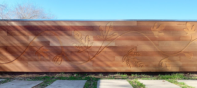
Without getting lost in all this, I bring up these questions as the backstory to my design and construction of a backyard fence. After considering several options for demarcating the property line, it felt like I had spent enough time figuring out what my CNC machine could do in the abstract during this pandemic. Eventually it came time to consider what the fence wanted to be, what it could be. We have a really productive fig tree in our backyard and this seemed as good a motif for the yard as anything.

Of course, replicating nature with technology is a lot of work. I found it considerably more labor-intensive than generating a simple orthogonal pattern of some kind. But it felt like a good moment to remind myself that computers can be used for both economic reasons and for reasons of beauty. This fence was an endeavor to pursue the latter. 

Admittedly, it was not the most cost-effective solution, constructed as it was with Heart B Redwood tongue and groove boards.

As an architect, I have read a lot about digital fabrication but I have seen little effective evidence of its implementation in the world around me. Most often I see it in restaurant signs and patterned guardrails on commercial buildings. 

Exploded Diagram of Fence Boards

Like so many other construction tropes, the manifest solutions are often formulaic and can be implemented on a fairly repetitive basis. It doesn't take long for these constructs to look "tired" as they enter our collective unconscious on a large scale.

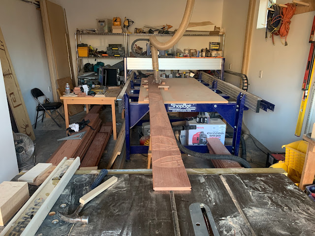
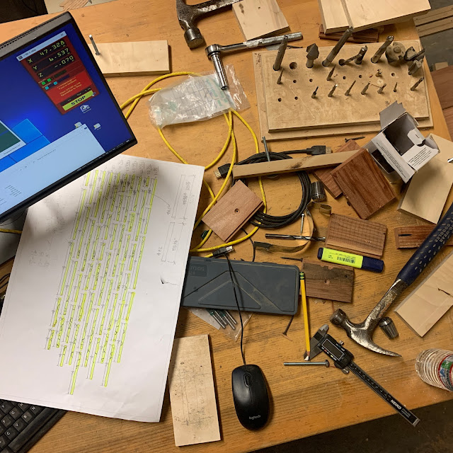
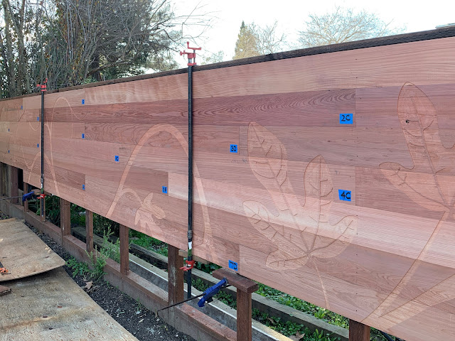
The fence required the milling of 54 separate boards that were designed to "tile" on the fence posts to create an engraved mural. It was labor-intensive, and honestly, in the middle of it, I was worried I might wind up wasting too much expensive wood getting my head around the process. 

Thankfully, the CNC mill performed as expected and the process has opened up a new way for me to make beauty out of simple natural materials. I don't know that I will always have the time I spent on this prototype, but the option to do some manner of a natural motif that is tailored to a site has piqued my curiosity and I look forward to the chance to explore it again sometime soon.

Close-up

Clamping the Redwood Boards 

Prelude to a Fence by Michael Cobb

Ever since I have lived at our present home, there has been a very sad fence on the property line we share with a our neighbor. Like some mysterious archeological dig, this fence had history. Near the street, this fence line held a pretense of normalcy. However, as it progressed from the front yard to the back yard alongside our driveway, a series of unfortunate construction details ensued. 

I don’t know specifically why the fence was cast on a concrete curb…I have theorized it was to keep some previous dog or rodent from digging under it. This would all be well and good if the wood that was cast into this curb, was holding up. It was not. In stark contrast to the unusually substantiality concrete curb, the wood fence above it, was precarious. “Teetering”would be a good descriptor. When it came time to purge the yard of this ailing fence, the wood fence itself would go quietly. The concrete curb was another story.

Intermittently, fence posts would penetrate this curb and descend into their shallow and insubstantial concrete footings. The post’s width was essentially the same as the curb, so everywhere there was a post, the curb would be interrupted. So much for using a concrete curb to maintain a separation of wood from soil! To make matters worse, the demolition of this fence was made so much more challenging by the existence of this curb. Removing a rotten wood fence is one thing, you can push it down. Removing a continuous concrete curb with sporadic shallow concrete post holes, is another matter. A trip to Aaction Rents to get a jackhammer is required. A digging bar is required. Ear plugs are required. A flexible back is a plus also. 

If the new fence wanted to be a strong and healthy one, with even post spacings, the curb and its post holes needed to go. While typical yard work might be pruning bushes and mowing the lawn, this fence replacement felt like cruel and unusual punishment.  As you might imagine, the new fence design did not have the same random post spacing as this old fence. As such, it was really impossible to avoid casting new post hole near, or partly in, old post hole. The new concrete holes often took more concrete than the old ones did. 

We are now half way to the back of the property…

After the teetering-wood-fence-atop-poorly-constructed-curb experience we encounter a redwood tree. This is not your Platonic ideal of a Redwood tree. This redwood tree was a miserable redwood tree specimen. Maybe it is a misnomer to call it a tree? It might be more appropriate to say this redwood tree was a bush left over from some far more noble creature that had existed freely. A time before people came along with their appetites for fences and reduced it to the miserable creature it now was. Imagining it now, I would describe the “event” like passing an accident on the freeway. A fence had clearly had an accident with a tree. It was not clear there would be any survivors.

Moving past the tree accident we now encounter the third act. Here, whatever aspirations the fence builders had to make a straight fence, have been abandoned. More small trees arise. Whoever had worked on the fence had, at this point, clearly abandoned all hope of making it to the back property line without resorting to desperate measures. The fence bobbed and weaved around the trees. Sometimes it appeared the carpenter had needed the tree to hold up the fence. Other times it appeared the fence was being pushed over by the unruly trees. The post holes became shallower as roots complicated excavation. The unreliable tree branches became poor substitutes for footings as the fence leaned against these forms with increasing frequency as the fence terminus approached.

As awful as it was, there is something about this found chaos that excites in me the potential alchemy of a new design. This kind of work is far from the trophy projects I am guilty of wanting. On the other hand, if I was honest with myself, it is this challenge that is far more prevalent and has the reliable distinction of being the major substance of design work needed in the world. Let this be a relief. Look at how low the bar is? Witness the previous design train wreck. This is all that there is to surmount in order to call your subsequent project a success. If you simply do this, you will be a kind of healer. If you can make something that tempts beauty, the whole experience will become a kind of transcendent experience that feels reliably good.

There is no better place to implement a design than in these scarred places. As an architect, I believe our ability to reshape our world can positively impact our existence. Making a shelter that fosters human inhabitants in the unkind wilderness is one of the clearest and conspicuously heroic examples of a designers craft. We have all seen the beautiful mountain retreats, cliff top homes and vineyard estates. A handsome structure ensconced in a nature setting is a compelling and lovable image. There is the potential for (excuse the pun) ground-breaking work in this setting. 

New technologies can be used to harvest resources in creative new ways. It is a wonderful gift to have these kinds of projects. But there is also a escapism here that we can lose ourselves in. Are the cliff top dwelling in a design magazine, the civilized rogue of a male magazine model or the wild beauty of a cover girl, really so different? How much of what we see in these images is of any real substance? If we permit ourselves to look closely, there is often a lot less substance there than we might care to admit. This idea of remaking nature has lost some of its nobility. Yes, it is still a wonderful undertaking when done responsibly and sensitively. But let’s face it: It isn’t always done this way.

Few here in California, can reasonably give that compliment to the vast majority of our constructs. Many, including housing developments, are speculative ventures designed with an industrial ethos geared to generate income for someone who is not necessarily living there. In many ways, the fence I had in my backyard was this sort of thing. It was either built by a renter who had not stake in the outcome of the property, a landlord who was a slum lord or a homeowner who, unfortunately, did not know how to build. 

Given all this, it is hard to escape the sense that good design and construction should be implemented here as much as anywhere; in the places where humans had already built but good design and care had been foresaken. Expediency had ruled the day. Let’s skip a few pedigrees and edify a rescue dog!

In many ways, California is America’s side yard. Even if someone gets a piece of land and it feels untrammeled, chances are, if one looks closer, they will see the traces of things that came before, that have not been entirely unearthed. Robinson Jeffers spoke of a “cabin in the woods under spared trees.” Every form of construction is like this; a form of destruction. 

I could speak about the tired and self-evident need for some kind of sustainable design, the truism that we must, in good conscience, leave something better for our children by more being sensitive to our natural environment. Beyond this goody goody language, I believe there is something more primitive and primordial that coconspires with this more sanctimonious and hand-wringing rhetoric:

We want to generate beauty out of natural resources. That kind of sensitivity is both a coping skill and an homage. This ritual inevitably generates a kind of respect for our environment that does not need to be taught. Sensitivity is incidentally learned on the way toward goals that are of a more immediate, and perhaps more self-serving, nature. It’s okay. It might even be healthy.

We can forget about all this when we are afraid. Afraid that we aren’t going to survive if we spend our time making beautiful things. Afraid that there is not enough time or energy to be spent on such endeavors. All of this is perfectly understandable and equally sad. We also know that living in fear, is no way to live. 

“What you can do or think you can do, begin it. For boldness has magic, power, and genius in it.” -Goethe

I myself am certainly no exception to this ethic of expediency. I have done, and will do, many things to “just get them done” and I am grateful to my partner Lisbet and my children for being patient with me through this fence project. It was clearly about more than just putting up a barrier and I know there were moments when it competed for my time with other more social activities.

The fence I built left a lot of room for improvement, but the shortcomings were more the outcome of pushing myself to make something I had not made before and not the shortcomings associated with a rushed process that I was familiar with. I look forward to sharing that fence design in the next post.


Fastener-Free Studio Table by Michael Cobb

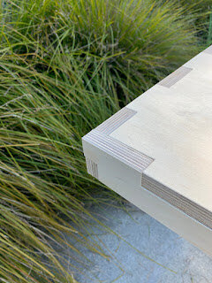
The idea for this table was to craft an attractive and usable piece of furniture that was readily reproducible at scale and would be implemented for initial use in our office. We didn't know how many we would ultimately need for the studio space and the notion of something reproducable on-demand, was compelling.

In the past, I have expediently used utilitarian foldable tables like one sees at bake sales and school registrations. Unfortunately, many of the affordable table designs prevalent today are unable to attend an architectural interior as a legitimate piece of furniture.

I've always admired the modernist design aspiration of creating something both utiliarian and attractive and there was a clear call for something with warmth and presence for our office space.

With this basic premise, we made a series of parametric toolpaths for the studio Shopbot on two sheets of plywood. Because these toolpaths were written parametrically, the design can be "flexed" to accommodate different sizes and shapes as needs dictate in the future. 

More information on the making of this table can be found at: 

https://www.instructables.com/Russian-Birch-Table-Without-Fasteners/

Rhombic Dodecahedron Stool by Michael Cobb

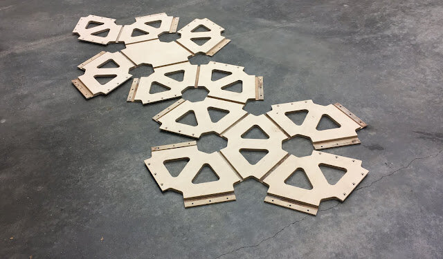
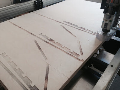
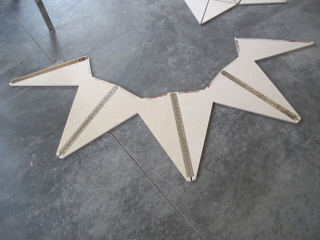
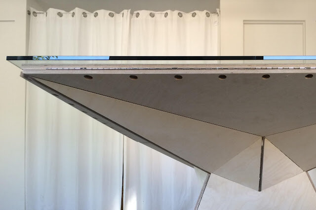
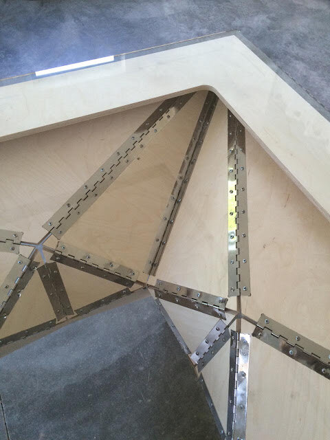
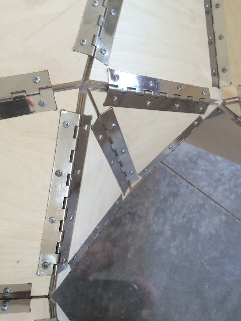
This latest chapter in a fascination with folding has been challenging. For several years now I've been interested in using CNC technology to create folded plywood objects.  Initially this involved applying piano hinges to pieces of plywood to make furniture.  You can see examples of this

here

 and 

here

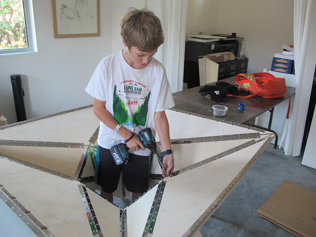
Over time, this method of cutting piano hinges and screwing together the joints with the hinge leaves felt complicated.  You had the many faces to cut and then you had the many hinges to cut. For something that was suppose to be automated, I felt like I was working on a methodology that was pretty involved.  The
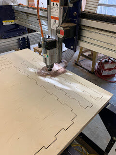
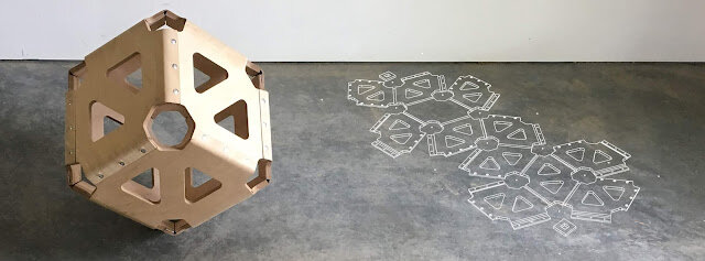
table design

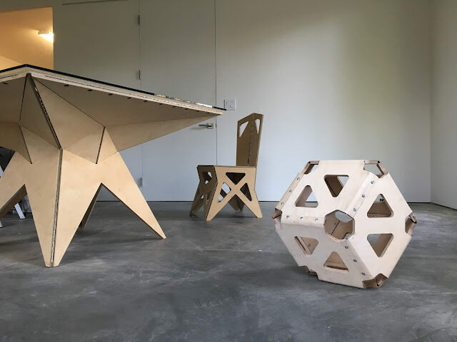
worked well for the most part because of the glass top that allowed one to peer down into the bristling interior.  I liked the clean star-like radiating lines but when I made

the chair

, the object felt too mechanical.  It was felt like a Frankenstein chair for a would-be Frankenstein.  It also wasn't all that comfortable.   

It was pretty clear what the simpler solution was...if possible.  I needed to "weaken"(but not break!) the plywood joints enough to steam bend them.  This would capture the wonderful simplicity associated with origami and create more supple and fluid shapes.  Undoubtedly this would come with a structural and mechanical price.  How far could one bend the steamed joint?  How strong would the joint remain after this bending? I didn't know if the thinness required for steaming would also render it too weak to support my weight. Would it break the first time someone sat on it? I'm happy to say it feels pretty strong after all the faces are connected.

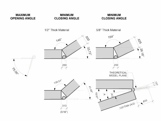
The term "thick origami" is a phrase that has been emerging recently and in many ways the piano hinge furniture represents the clear geometric challenges associated with this way of constructing things. The plates, instead of all pivoting off one side of a cutout, pivot off the convex side of the fold.  This complicates the geometry of the cutout substantially. 

But this most recent furniture example is more challenging than objects made with this purely hinged approach. This stool - and hopefully future builds - does NOT exploit the use of fabric hinges or pivot hinging and their clear points of rotation. 

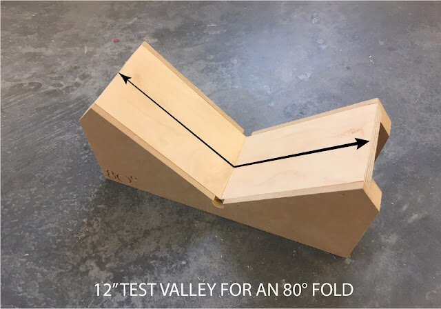
These "pliable sheet" builds hope to account for the anticipated deformation that occurs at steamed joints and compensates for this in the initial flat geometric layout. I've made several efforts to collect data in this regard. More data collection is in the works as I am working toward a strong 90 degree bend.

It is an exciting time to be working on this. Fabrication methods are evolving quickly in ways that strive to take advantage of both the structural and esthetic characteristics of the CNC approach. There are a lot of techniques to get comfortable with. Some examples of this:

What is the most efficient and accurate way to do a flip mill of a sheet of plywood? 

How does one tighten up the tolerances on the CNC machine when accuracy begins to degrade?

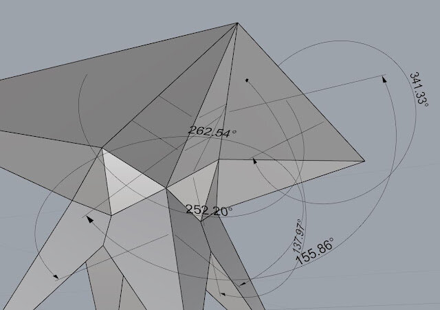
In parallel with these challenges there were, and remain, many questions about how to best modify the plywood to accomplish a good fold. Larger angles of folding remain a challenge and there are tradeoffs in seam width and depth with respect to flexibility and strength. This initial project was chosen, believe it or not, for its simplicity.  While the shape might appear somewhat complicated but it has this going for it:  All the dihedral angles (the angles between the faces) are 60 degrees.  

This made the initial folding ritual less complicated and did not impose too much stress on the joints.  Having said this, my first pass at this stool had several joints crack due to inadequate steaming.  I got discouraged and thought about giving up. I want to thank my son Jesse for telling me he could use one in his bedroom if I was able to finish it. This gave the thing purpose beyond the abstract and vainglorious desire to solve some large abstract design challenge.  There have been big improvements from where I started out, but the whole thing is definitely a work in progress.  The challenge of a good reliable steaming mechanism for the joints continues to be a large focus. Both the CNC and steaming techniques can use improvement.

Stay tuned for future pliable geometry.  

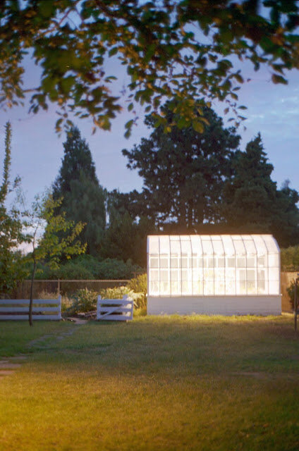
Looking Back at a Greenhouse Built Twenty Years Ago... by Michael Cobb


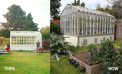
Joyce Gross was kind enough to share with me some recent pictures from her wonderful garden in San Leandro.  She inherited a greenhouse I designed and built over twenty years ago and she graciously sent me some recent pictures of the building as it stands today, newly renovated. A thank you to Michael McGee as well for doing the much needed repairs. It felt like an appropriate time to revisit the project.  If you get a chance, check out her blog too.  

It was a turbulent time in my life.  I still hadn't taken the architecture exam and wanted desperately to finally design and build something meaningful.  This little project, so modest in scale, remains large in my mind.

At the time, mass customization hadn't taken off yet. I remember driving over to the Simpson Strong Tie plant a few miles from my house in San Leandro. I had a floppy disk with a DWG file on it for the plant manager. They didn't usually work with other people's files but if I wanted to bring it over, he would try to use it to cut out what I wanted.

San Leandro use to be called Cherry City before it became an industrial center and the Broadmoor area, where I grew up with my Dad, Grandmother and sister, still had a few larger lots with vestiges of this older agrarian time.  Our backyard still had a concrete slab where the barn use to be. The barn was before my grandmother - a school counselor and music teacher  - got ahold of it. She kept many of the old trees and added others.  There were cherry, lemon, orange, persimmon, plum, peach, tangerine, fig and apple trees all in her backyard.  I'm certainly grateful for the "advances" in our environment today, but looking back that situation seemed "abundant."

I haven't seen the neighbor, who hired me to do the greenhouse, in many years. He was an interesting man.  A physicist who worked out in Livermore, he was very open to experimentation.  He use to joke that he didn't understand why architects didn't treat building more experimentally.  "Why don't you build a prototype that could be rebuilt after we see the flaws?" he would ask.

I've always liked that observation of his. It exposed a basic difference between architecture and so many other technological undertakings.  Cars, airplanes, bicycles and other devices have such explicit functions but architecture in many ways is constantly being adaptively reused.  It not only tends to exist in time for longer than these other things, it also can change its function over time. It is not unusual for the hypothesis of the experiment (e.g. "let's build a one bedroom house") to change over the span of this experiment we call construction.  So many buildings get additions or remodels over the course of their lives. Cost aside, this in itself, tends to discourage a sense that a rebuild would improve things substantially. You get one crack.

For whatever reason stars aligned.  The neighbor hired me to build a greenhouse for his orchids. I was coming off a painful divorce and wanted a physical task that would keep my mind and body occupied.  My grandmother had a bunch of old panes of glass from a disassembled greenhouse that use to be standing in her backyard so I designed a greenhouse around adaptively reusing these old panes of glass.  We reused all her old glass in this greenhouse design.

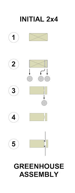
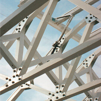
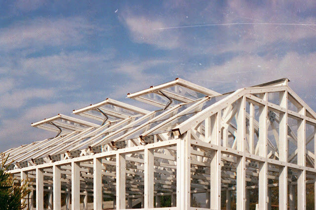
Greenhouses are simple and elegant structures comprised predominantly of structure, "stops" (to hold the glass in place) and the glass itself.  Because the budget was so tight I designed an assembly where both the structure and the glass stop were derived from a single 2x4. Similarly, the CNC metal plates cut by Simpson Strong-Tie allowed 2x2 pieces of wood to span the entire width of the greenhouse.  This created a branch-like clerestory that felt sympathetic with a house for orchids. It still allowed good penetration of  sunlight.


Instead of wiring the greenhouse with electrified window operators we used passive solar "autovents" that utilized a mineral wax piston that expanded without the use of electricity.  During the hottest part of the day, the skylights open on their own. In the evening the skylights close and help keep the plants from freezing during the night.


The whole thing was a function of economy.  So often when this term comes up in design it is  associated with "compromised beauty."  "If only we had a larger budget, the design could be so much nicer."

For me, the design experience of this greenhouse stands as a contrast to that logic.  The reasons are hard to articulate but I keep it in mind when I'm up against tough economic design constraints. Certainly there are flaws in the design and the limited budget did require working with crooked material and thin glass, but when I consider the more conventional work I've done, it seems to me the ingenuity that the budget necessitated generated something other work might have lacked.

A big thank you to Joyce Gross who has made such a wonderful backyard environment of which this greenhouse is but one part and for sharing her shots with me.  Check out her blog to see some beautiful plants a few more shots of the greenhouse.


DIY CNC Cabinetry: Cultivating an alternative to the Home Depot/IKEA model. by Michael Cobb

The Cabinet Carcasses


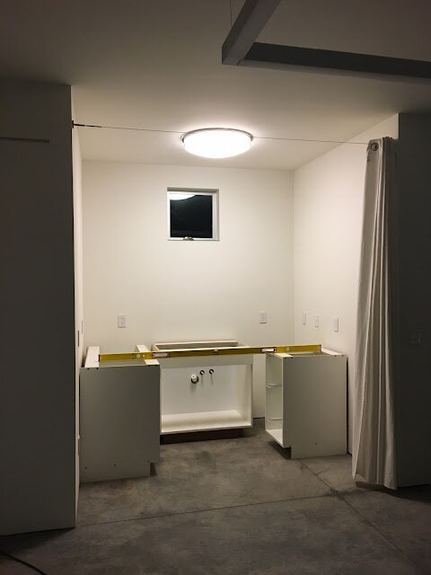
I've had a small cabinetry project in the works for a while.  It needed to be done on a shoestring budget.  I made the requisite trip to Home Depot and tried to keep things simple.  Three Melamine cabinets in a "U".  One cabinet for each leg of the "U".  The doors would be simple slab doors.  Nothing fancy. For the uninitiated Melamine is pretty much the same thing as "Formica" (or HPL).  Both products are essentially a resin impregnated paper finish covering a "lovely" particleboard core.  Melamine just uses a thinner paper and therefore presents less of an edge at corners.  It is both cheaper and more esthetically appropriate for cabinet boxes and fronts.   Formica is more logically used on countertops for its wear resistance and that is the probable choice for the counters on this project down the road.


Even at Home Depot, these three stock cabinets were $2500.

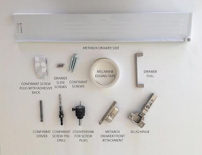
Cabinetry can be tedious work so I'm not ungrateful for that pricing. But the Shopbot in my studio was the obvious alternative. What could be done with sweat equity for a fraction of the cost?  It also felt like the hardware quality could be improved on. The Blum Metabox system was used and I ordered these components, as well as some good drawer pulls at CabinetParts.com.   This greatly simplify the assembly process and helped to ensure good operability.  So far the project is looking like it will cost somewhere around $700 in parts.

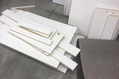
The milled panels


It is worth noting that there is an MDF (medium density fiberboard) alternative to particleboard for the core of these products.  For this application it felt unneccessary and would have sourcing the material more challenging. I still used my friendly local Home Depot for the raw Melamine sheets.

Thus far the cabinet carcasses (or boxes) are complete.  I used Confirmat screws to assemble the boxes and was relieved to see I could attach the panels to each other by hand quickly and easily.  The CNC toolpath writing is primarily useful for locating door and drawer hardware, which can be unforgiving with a lack of precision.

It is also important to get your cutting speed right since Melamine has a real tendency to chip.  A lot has been written about how to avoid this on line.  I found a compression bit really helped to minimize this although it is my single biggest concern on the project. If the drawers and doors turn out okay, the process will be posted on Instructables in the future.


Pollarding a tree? Make a Wattle Hut! by Michael Cobb


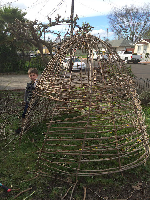
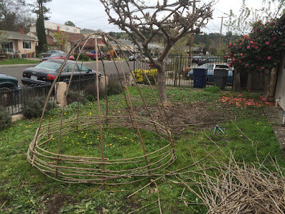
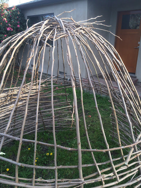
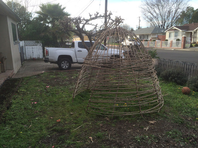
There are a lot of Mulberry trees on our street.  For years, at some point in midwinter, most of my neighbors get out there and pollard them, leaving the few remaining branches to remain with their denuded cauliflower stumps.  Without being entirely sure why we do this but not wanting to be the pariah of my good neighbors I have gone and done it too.  I think the previous owners of my residence were field workers and they did some interesting braiding with the branches. I've always liked this little flair of non-conformity.  That creative branchwork has been something I wanted to riff on further. While there are many shallow justifications for pollarding online I've been unimpressed by their rigor. The whole thing feels a little like cropping a dogs ears or something. Since I didn't really know why we were doing the cutting to begin with, I wanted to imbue this ritual with more meaning.  Today my boys and I got out there and finally made a small wattle hut.  A coupe notes on the making process.


1. To trim the tree correctly you have to cut the branches relatively close to their base.  
2. To do the wattle correctly you have to recut the base of the branch so the associated curved element segment is eliminated.  This allows you to work with a fairly straight "bow-like" piece.  


3. I thought it might require more than one tree to make this structure and I stock piled three trees worth of branches before starting. Ultimately, I think you can do it with just one.

Anyway, if you want to lighten the load to the dump and your looking for something useful to do with your pollarding you might try this (or something else!).


A Grasshopper Routine for Generating Folded Plate Forms by Michael Cobb


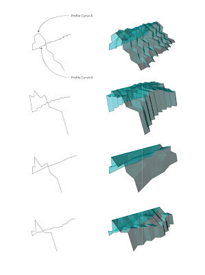
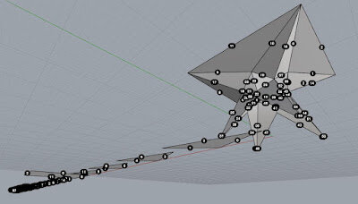
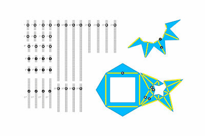
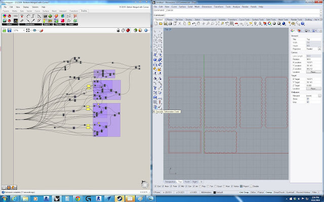
A routine for generating folded plate structures was recently completed here at the studio using the parametric Grasshopper software.  A few examples are depicted above.  This routine is intended to facilitate the creation of folded plate forms for various architectural uses.

These forms are becoming increasingly easy to build due to mass customization and computer milling, but it is my sense that the forms are still largely avoided in the built environment simply because the design process is so tedious.  After recently completing a few origami-inspired furniture pieces, seeing the St. Loup Chapel and enthusiastically reading a recent paper about origami and folded plates (by Hani Buri and Yves Weinand) I decided to take a crack at simplifying this process.


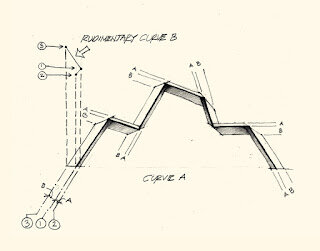
The forms in this routine are generated by simply sketching two curves on two perpendicular planes with the two curves sharing a common point of beginning.  As curve B sweeps along curve A it reverses orientation at each new line segment. This generates a complex array of alternating origami-type "mountain" and "valley" folds.  The geometry of these forms is complex enough that not all curves will be initially deployable but after a bit of editing, the user will quickly develop an intuition for how the curves can be modified to function properly.

Origami Table by Michael Cobb

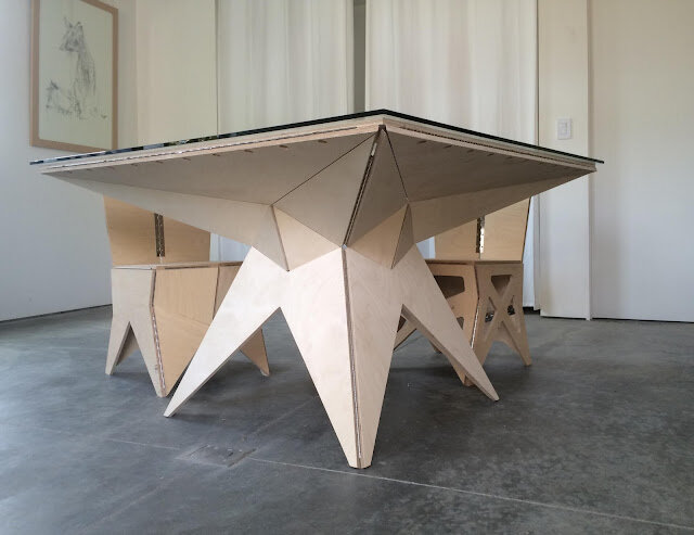
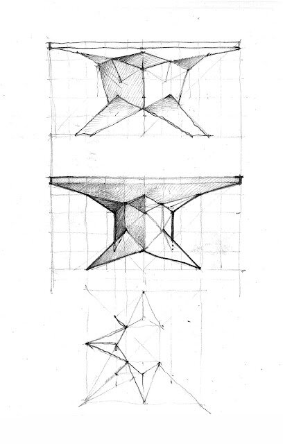
Mixing memories of childhood origami with "folded plate" structural ideas, has been a rich vein of inquiry for me.  So much is happening with prefabrication and panelization right now. It feels like a good time to be riffing on this.

A while back I did a series of chairs on the Shopbot. Following the 3B chair, I wanted to attempt the more ambitious task of a table.  From a structural standpoint, the chair was relatively easy but the challenges of taking a thin "paper-like" material and making a table was more daunting.

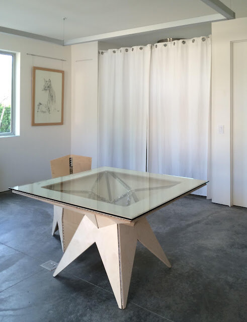
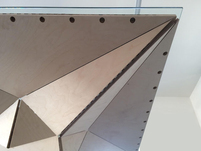
What follows are some excerpts from the design and fabrication process.  There are also a few shots of the final outcome.  I wound up designing about nine different tables before making the one we see here.  We even partially built one of the previous designs before giving up on it as too "floppy".  In fact, this new table is made up of facets from the previous design.  This way of working is easy with hinges and something that makes up for the heavy computer time that is really required to pull off this sort of fabrication process.

The reality is that this way of putting things together is relatively new and there is a lifetime of work with this tectonic. I'd like to see how this might inform some other objects for a bit. In short, while there are still refinements, it felt like a good time to post the results of the work and see what comes of it.  A big thank you to my two amazing sons Jesse and Niles for their help. I also wanted to thank Steve, at Arrow Glass, for supplying the tempered glass top.


Custom Boxes On-Demand by Michael Cobb

If anyone needs a custom sized tongue and groove box I've written a routine for the Shopbot on Grasshopper that should be able to generate a moderately sized box of any dimensions with a lid that fits snugly on top.  Just give me the three box dimensions and the material and we can make it happen.  The cuts are very precise and the outcome should edify any material that's used from MDF to European multiply plywood.  If the box is on the smaller side we can even use good old fashioned solid lumber.

Community Meeting at Middletown High School on Rebuilding After the Valley Fire by Michael Cobb


The first post-fire community meeting on rebuilding occurred tonight at the Middletown High School Stadium. I couldn't be late and was rushing. When I came to a traffic jam approaching Middletown on 29 I turned onto a residential street to avoid the blockage. It didn't take much to feel like one was on the backside of a movie set.  The devastation was thorough and complete and reminiscent of the Oakland Berkeley Firestorm.  Burned out cars, and rubble were everywhere.  


It was a moving experience seeing all the people in need of help and the various agencies mobilizing to come to their aid. The first step is the toxic clean up and this can result in a substantial removal of soil and concrete from a burn site.  This excavation can leave quite a depression that requires new soil to be trucked in.  Many homes in the area predate the elimination of asbestos and lead in building materials and its important the soil tests free of these materials prior to the owner's reentry. There is also a real incentive to get these sites cleaned up before too much debris gets blown around.  The rebuilding effort is just starting.


I was honored to be asked by the AIA to say a few words about the rebuilding process to the community and as I thought about my remarks leading up to the meeting it became increasingly clear that people were just getting their heads around a big change in their life. The actual building of a home was a ways off and the practical advice people needed at this point was how to navigate the often byzantine insurance process, show proof of loss and secure a fair payout. For architects this work is primarily confined to the forensic task of documenting the pre-fire condition of the structure and capturing as much value in this description as possible.

PG&E has already run over 100 miles of wire and put 750 new telephone poles in the ground. Leaving the meeting it was heartening to see the main drag of Middletown lit up inside various store fronts.  The people inside these oases of light seemed to be experiencing a kind of community, for all their other loses, that other towns seem to lack.  One saving grace. It reminded me of Greg Brown's quote "This whole idea of intentional community is a bunch of bologna.  You gotta need each other." I'd like to believe people need each other even when they don't realize it but the people of Middletown are under no illusion.


A Couple Recent Remodel Projects by Michael Cobb


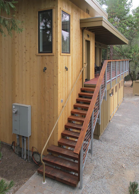
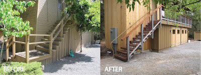
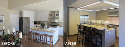
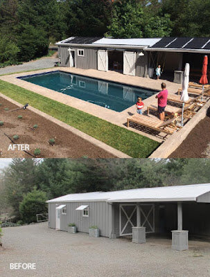
This last year has seen several remodel projects.  The two shown here represent a pair of projects near completion.  Often when there is a remodel - even if the building's function is changing - this is also an opportunity to address deferred maintenance, improve durability and increase strength.  All this is equally an esthetic opportunity to improve finishes, compose geometry, simplify form and improve function.

Kenwood Accessory Building
General Contractor: Sonoma Building Associates

Kenwood Accessory Building
General Contractor: Sonoma Building Associates
Glenn Ellen Kitchen Remodel
General Contractor: Chapman Construction
Glenn Ellen Kitchen Remodel
General Contractor: Chapman Construction


Bodie: A Lifetime Coming... by Michael Cobb


Like traveling by rail, going to Bodie California is to situate yourself in a historic place most Americans bypass.  The surfaces of the human landscape here speak of our civilization's frailty but they also speak of the essentially hospitable nature of this western land.  There are about one hundred and forty buildings still standing in Bodie.  Many are from the 19th century. The park service uses a great term to describe the maintenance of the buildings: Arrested decay.  With or without this relatively minor human intervention the place confirms a suspicion:  Figuring out how to impose permanent structures on the land is not a central challenge for California architecture.

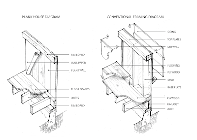
In fact one could argue a misplaced obsession with architectural permanence is exactly the cause of our present economic and environmental woes.  Does every drink of water really deserve its own plastic bottle?  To make things last only to use them in a disposable way is perhaps the most wasteful scenario one can imagine. A subtly more worthy and challenging goal is to strive for harmony and craft in our often speculative and impetuous cultural landscape.  If one compares the way buildings are built now with the plank houses at Bodie one can see how things have "advanced".  More parts have been introduced to address things discretely instead of embracing the economy of one element acting as something multi-functional (e.g. a board acting both structural and weather resistive).


When I tell my friends about the Bodie visit, most people have never heard of the place.  The quarter million annual visitors are largely foreigners. It is easy to think of Bodie like an odd French obsession with Jerry Lewis or Marilyn Monroe; an affection that seems somehow misplaced and romantic.  But this is too easy.  Bodie is one of the few remaining monuments from our settler past and it has lessons to teach us about the virtues of a simpler approach.  Many architects and carpenters muse about how things use to be built here.  Go to Bodie and see.  The simple plank house can be seen in all its rich and improvisational variety.  There are over one hundred buildings.

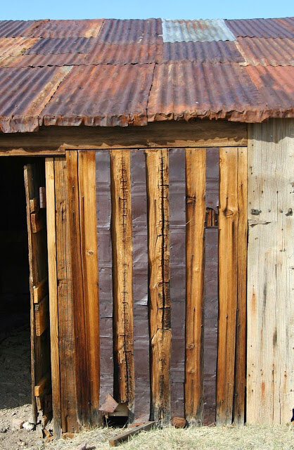
Flattened sheet metal containers acting as battens


Bodie is such a contrast to how europe memorializes its civilization. One can't help but wonder if it is only the distance from our existing civilization - so driven by our free market forces - that has spared this place the bulldozer.

About 70% of all US citizens live in megaregions. Despite the fact that at one time Bodie was one of the post prosperous gold mining towns in California, to visit it now is to venture off the beaten path.  You can't see it from one of the interstates of our megaregions and it provokes the realization that the  interstate itself has a kind of consistent atmosphere despite the specific place it might traverse.

When I was a child growing up in California it was a yearly ritual to visit the Sierras with my father  and my sister for a week or two. A composer and musician, my father would would bring his violin with him on these trips.  When I got older he'd have me bring my clarinet too and I have many memories of meeting people from all different parts of the US and elsewhere coming together around the campfire for singing and music making.  While engaged in this "social camping", the last thing on our mind was to visit Bodie, despite its relative proximity.  No one talked about it.  We went to the Sierra's to get away from civilization and its discontents and Bodie, as a gold rush town, was a symbol of that legacy.  Perhaps for that reason it wasn't a place we ever talked about going while we were hanging out in nature for a week or two.

My childhood home was San Leandro in the Bay Area.  An area called "Okie hill" was tucked up alongside the freeway. This place was more recently known for having sporadic connections to the Hell's Angels, but its name went back to a time in California history when Oklahoma refugees landed there as a consequence of the dust bowl in the thirties.

My father really loved the dust bowl music of Woody Guthrie, the Oklahoma folk singer, and he was secretly proud of having taught his son, Arlo, music when Arlo was in high school back in Massachussetts.

When summer rolled around there in San Leandro we would head for the Sierras.  The exodus to the Sierras is a little different than it is now.  Many people aren't aware of the distinction that exists between national park and national forest land.  Even today you can camp for free in many part of the national parks without much paperwork - especially if you're not camping in an "improved" campground.  But most formal campgrounds today require a permit and often a visit to the mountains is preceded by an ironic stint spent in front of the computer making campground reservations.

Despite these "improvements" a few decades ago many of the summer campers were central valley citizens in between residences for the summer. Staying at a national forest campground was an inexpensive way for them to spend time with their kids in between school years without having to pay rent for a month or two.  The camping was free and the streams were stocked with rainbow trout using tax money. Even though the time limit for a stay was two weeks, I remember more than once a family just picking up their stuff and moving to an adjacent camp site to "play nice" with the rules and avoid an annoyed ranger. It was a practical way to make quality time for your children on their summer break. I've always wondered if their might have been some kind of continuation of the itinerant Okie tradition in these loose networks of people that I hungout with for a few weeks each summer.  So improvisational, so unpretentious and somehow so warm and human.  Sharing fishing tips, marshmallows, matches and music; I've rarely felt closer to my fellow human being and nature all at once.  Without exactly knowing why, surely there is something meaningful in the pursuit of a light environmental design that celebrates these two vital aspects of human existence simulatneously.

Chair Design 3B is Available by Michael Cobb


The latest iteration of folded plywood chairs (chair 3B) came off the shopbot today.  As an architect I've been interested in the indirect ways paper can create form for a long time. A good drawing can be both inspirational and instructive.  Schematic design drawings hopefully inspire.  Construction documents try to be instructive or at least descriptive.  Together these two kinds of drawings aid and abet the execution of many effective projects that would suffer in their absence.  


In the professional world of architecture it takes a lot of hard work to make a rigorous drawing.  A refrigerator that is the wrong width can make the project impractical or costly.  A beam can be drawn too shallow for the distance it has to span.  "Paper architects" are the unapplied ones who make these mistakes. In this sense our connection to paper is often something we try to downplay. Lebbius Woods, a famously theoretical architect, once said rather shockingly: "Architects don't make buildings, they make drawings." ...the truth hurts. There is something "indirect" about the discipline. Some direct ways of using paper are also intriguing.

When I was a kid paper had an entirely different reputation. Making interesting things out of paper was perhaps the most resourceful "MacGyver" thing one could do. Anyone who could take a banal piece of paper (especially the kind that you used for school work) and turn it into something that could fly around the room had gift. Kids who knew how to do that? They were alchemists!

In this way I think making paper airplanes and architecture are the same thing. They both create a substantial leap in meaning with a few carefully considered "creases";  The material is still evident but the new object is no longer called by its material name.  Now it is a "plane" or a "building."

Origami personifies this to me and I wanted to make a series of chairs that recalled this simple alchemy from my childhood. There are many parallels between today's panel technologies (SIP panels, Plywood, Fiber Cement etc.) and these early inquiries into paper. In the recent past I have wanted to incorporate this early origami thinking into my building designs. SIP panel technology, where entire walls are made at a factory, was one way to approach this.  The idea of complicated building geometry being handled in this more precise manufacturing environment holds some real promise.


But there are many other constraints that often overwhelmed these early efforts and ultimately it was more important that the client simply have a functional and beautiful building.  They didn't need a thought experiment.

Nevertheless I do think it is important to dream and often the pressures of executing an affordable project for someone else can make this dreaming seem frivolous; not unlike a paper airplane in the classroom.

In short, I have wanted to reconcile this vitally whimsical world of art and this serious world of construction. I find they are so often at odds. These chair designs try to address the very literal parallels I see between paper and panel technologies with a few inquiries into chairs. Understanding the way this CNC machine works and how the hinges and plywood behave has been a central preoccupation of this endeavor. Hopefully there is still a whiff of origami whimsy about them. I also hope there will be more of this work-in-progress to come. There is no "final design." This chair is made from Latvian marine grade plywood and steel hinges. The finish will likely be a tung oil. With two chair coming out of one sheet of plywood they should be relatively simple and affordable to produce. Please feel free to contact me if you're interested in ordering some. Modifications are certainly possible and even encouraged.

Michael Cobb
info@studioecesis.com