On the Studio's New CNC Machine and Materiality Today by Michael Cobb


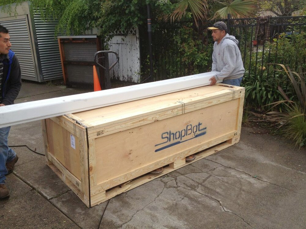
After many years of discussing the possibility with friends and colleagues I took the leap and ordered a Shopbot several months ago.  In many ways I was lucky to be able to do it.  Among other factors I had the good fortune to get many pointers from two very capable ex-interns (Jonathan Odom and Benjamin Rice).  I had no idea what it was going to look like when it arrived.  To say the least, the box was a little intimidating!  With a big influx of REAL work (so grateful), I spent the next two months assembling this thing on nights and weekends.  An hour here, an hour there...

Let me just say, in general, the Shopbot support in Durham North Carolina is amazing.  I'd have a question, take a picture and wait a few minutes to a few hours for a response.  This happened even on the weekends.  They were great.  As I watch the machine work, it feels very reminiscent of watching the plotters that existed before inkjet technology.  An intriguing analogy might go something like this:  Shopbots are to Plotters what 3D printers are to Inkjet printers.  

A lot of people wonder if the machine is like a 3D printer and because of the aforementioned analogy I'm quick to school them.  I respond with another analogy:  There are sculptures that work additively with clay and steel and there are ones that work reductively (i.e. carving) with materials like stone and wood.  For the time being, the 3D printing world makes things additively out of relatively "silly puttyesque" materials; mostly plastics.  The CNC milling table (e.g. the Shopbot) on the other hand, works reductively with wood, aluminum and or foam.  If one looks at automated drawing machines, Plotters use actual pens.  Inkjets... well, I actually don't know what that stuff is.  Thermoplastic? 

I'm going to abandon this discussion of 2D imaging and 3D forming for a moment to discuss a wider notion of processed things and unprocessed things.  I use this term "processed" the way foodies use it with the same general aversion foodies have to eating something whose origins have been so obscured by human intervention one no longer completely understands what one is eating.  It has always seemed to me this is not usually a good thing.

In architecture I have always sought ways to reconcile my mind's insular fascination with geometry - often associated with computer work - and a love of the natural world.  One thing is so internal and the other so shared.  In many ways this is the story of architecture;  Shaping nature and its materials to a kind of public artifice through a largely personal geometric endeavor.  This way of looking at architecture is the story of human's shaping the environment.  

But there is another story of architecture that is similar but inverted.  It is the less proud and more tentative story of architectural design as a kind of experiment. We forget that geometry is one of the mathematical sciences and therefore defined by experimentation. We may not state it explicitly but every time we undertake a geometrically complex project we often take some lesson from the process that we enjoy applying to our next endeavor and even our general comprehension of how the world works...smoothing out the wrinkles of our faulty understanding.  When the building is being built, no matter how confident I manifest to the client, I always watch the construction with a kind of skeptical curiosity.  

For those of us who love this kind of work, there is a deep peace that comes from this practice.  This side of the undertaking is underrepresented. Is there some kind of strange parallel between our lack of ability to recognize how much the phenomenal world is giving us in these undertakings and our larger environmental disrespect?  Forget about global warming, how curious are we about our environment?  I don't mean the scientific studies.  This often feels like more interest in our own human cleverness.  How interested are we in being out there in it?  Isn't this a more basic question?  

Back to the CNC machine...

I spend a lot of time watching the highly processed images on a computer screen and I can't help but feel there is an analogy between this kind of processed media experience and the processed materials being produced by a 3D printer.  Despite an early california upbringing that revered figures from Thoreau to Edward Abbey I feel it would be disingenuous to not acknowledge I am also a creature or our very technological age and place.  Because of this, it feels to me like a central struggle of our time might simply be to try to find ways to cultivate nature while feeding our scientific curiosity and pedestrian drive for technological comfort. 

Gary Snyder once said, when talking about our scientific age "Who among us can explain how a telephone works...we take that on faith right?"  The same can be said of plastics and other highly processed humans artifacts.  We are in awe of ourselves and it just seems appropriate to try to make objects that also conjure thoughts of inhuman causality if we are to retain an appropriate interest in the larger world that fundamentally produces and brings beauty to our stuff.

All of this to say: The reductive process of CNC milling feels closer to the causal realm of raw materials than plastic's mysterious origins and, as such, it helps keep this particular technophile reconciled to what lies under all the blinking lights.

Cross Laminated Timber by Michael Cobb

Another revelation worthy of sharing in relation to the previous post.  The student housing project out of Sweden uses a relatively new building product called CLT.  This stands for Cross Laminated Timber and while the product is relatively unknown here in the states due to regulatory constraints, it is already relatively common in European practice.  An elegant synopsis of this technology can be viewed here.

Traveling the New Bay Bridge Trail by Michael Cobb

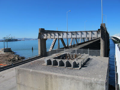
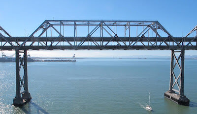
The new bay bridge trail is a radical new experience for anyone familiar with this part of the bay.  Travelling on the new structure, I was able to observe a relic from my past from an uniquely new vantage.  All the bay views were new as well.  The experience reinforced something I tend to forget:  It is the perspective and way in which we interact with our environment, as much as the environment itself, that shapes and defines our sense of a place.


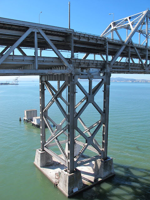
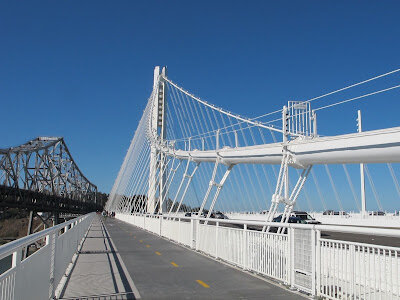
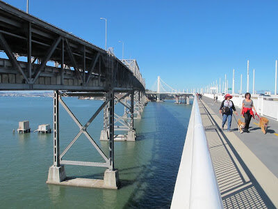
Travelling alongside a bridge I knew so well as a child was an oddly "out of body" experience if one considers the confined perspective from which one normally takes them in.   The difference in bridge colors only heightens this sense.  The new bridge is a celestial white and, as you travel in your parallel universe, you are able to see all the gritty supports and underpinnings of the old bridge.  There is a beautiful, somewhat gothic, quality to this old bridge.  There is something celestial about the new.


One rarely experiences the support structure of a bridge when one crosses it and in this way most bridges celebrate the idea of flight as they transport you aloft seemingly without the aid of any visible support.  When you do see the bridge supports on the new bridge, they are primarily cable tension members and have all the lightness that a suspension bridge maintains over a trussed structure.  You travel in a pristine world apart, seemingly airborne while the remains of the past lie in a soiled, heavy and run-down state off to the side.  The old bridge is literally marginalized.


The fact the pedestrian bridge comes so close, but does not touch down, on Yerba Buena Island, only heightens the removed and celestial state of this new bridge for the time being.  When it goes to Yerba Buena, as its slated to do in 2014, there will a new practical element to it that will be wonderful.  It will change the character of the experience completely.

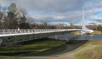
One further note on the nature of the new bridge needs to be mentioned.  For those familiar with the pedestrian "Sundial Bridge" of Calatrava in Redding, it is hard not to appreciate the impact of that smaller sensitive design with its glass floor and solar geometry.  For all of its larger functional goals, the east span of the new bay bridge is, in many ways, a "knock off" of this early Calatrava work.

Its nice to see good ideas take hold on more modest projects and impact larger projects.  For those in the design profession who are trying to cultivate new ideas, it is important to remember that the scale of a project can also send people running for precedent.  New ideas and project size can be inversely proportional and any small project is also an opportunity to create something truly new.  In this way, for those running a design business, there is a conservation of interest across project types.
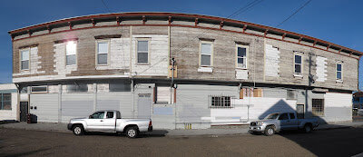
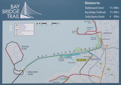
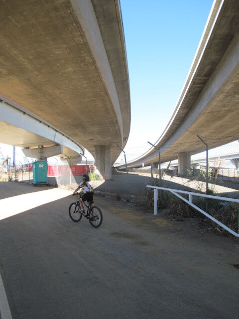
If all of this is sufficiently interesting to visit the Bay Bridge Trail, there are two ways to get on to this pedestrian/bike bridge.  The popular option appears to be from the Ikea Parking lot near the end of Shellmound Street in Emeryville.  The less hyped portal of Burma Road and Maritime Street in Oakland (see image below) is closer and provides ready access to the bridge base.


The Oakland entrance is more gritty and industrial than the IKEA parking lot but it also is easier to find parking.  It is presently my preference for this reason, since IKEA officially requires you to shop in their store to park near the access point.  Either way, you will approach the bridge in way that bay area citizens couldn't before now; weaving underneath the maze of onramps and off-ramps that precede the bridge.  Even here there is a strange industrial beauty that,  if there is the will, can be cultivated over time and provides a psychological respite from the exposed nature of the bridge.


Steven Holl's St. Ignatius Chapel: A Celebration of Panelization and Making. by Michael Cobb


Steven Holl's work has been interesting to follow over the years but I rarely had the chance to see it in the flesh.  A long time ago I saw a rather uninspired institutional example of his work at the University of Virginia but I suspected it wasn't representative of the rest of his projects.  Later I had the opportunity to hear him speak.  

I always liked his process sketches that were published in magazines alongside the images of the finished building.  Often architects will show off a glitzy computer rendering of their work and Holl's stuff was always very human.  It was easy to believe his sketches actually were part of the process.  Also, each of his projects was different.  Many architects pride themselves on a distinct style or look but sometimes this seems dogmatic when you see their body of work.  

Holl seemed to exist outside of this.  When I saw him he was speaking to an east coast ivy league crowd and he talked a lot about phenomenology and Rousseau and how this had inspired his work.  I liked the work more than the talk.  It felt like he was playing to the academic audience.  As I already said, one of the things that has always struck me about Holl's work is the way he sketches and seems to enjoy the discovery that comes from "doing" or "experiencing" sketching.  Drawing is not just a way to present an idea.  It is also a way to discover one.  

After his talk I approached him and told him how much I liked his work and how it seemed more american than he let on.  I told him I thought it was wonderfully pragmatic and he said "I am a pragmatist."  For a while after that, I kind of decided talking about design in a lecture hall was of limited use.  If european phenomenology and american pragmatism could be synonymous I just didn't know what all the words meant.

His approach appeared to be good old fashion pragmatism to me.  He didn't have too many rules, he was a tinkerer that knew when he came across a good building idea that worked for construction and esthetics and he used it irrespective of convention.  Unlike rule based ethics, he relied on past experience to guide his future actions.  It was improvisational and there was an inherent faith in mining the poetry of how a thing was made.  

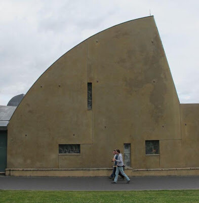
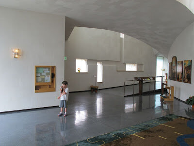
All of this to say, that when my son, Niles, and I finally had the opportunity to see his well-known St. Ignatius Chapel in Seattle while visiting an old friend in Seattle, I jumped at the chance.  It was not a disappoint.  It felt like one of the strongest buildings I've ever seen in the United States.  It was more than a building.  It restored my faith in the prospects for a meaningful american architecture.


Clearly the building owes a great deal to Ronchamp.  But much like popular comparisons between Van Der Rohe's Farnsworth house and Johnson's Glass House, we can draw parallels between Ronchamp and St. Ignatius and see cultural identity.  Ronchamp is sculptural masterpiece of abstract form.  St. Ignatius is a sculptural building celebrating it's making.  Those familiar with Irving Gill's San Diego work almost a century ago will see similar comparisons to Le Corbusier.


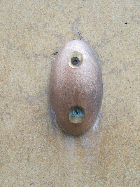
On St. Ignatius, the lifting inserts that were part of the tilt up technology used to assemble the building, remain as cryptic bronze-covered elements on the facade and the joints are expressed and one might even say celebrated.  There is something vaguely puzzle-like about the way they interlock on the facade.

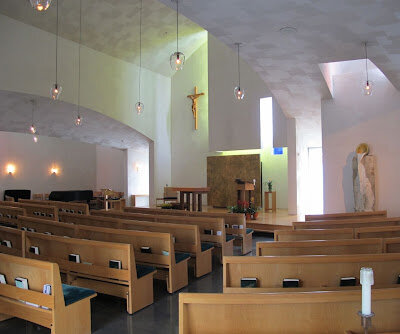
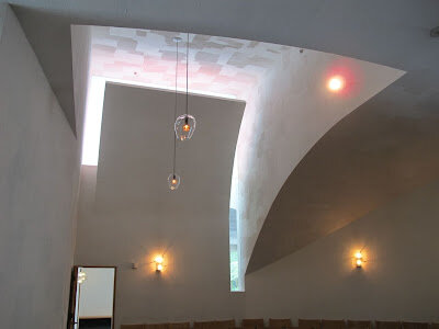
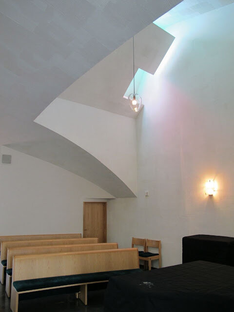
The roof is an entirely different creature.  Light wells are expressed sculpturally as part of the roof scape.  But it is hard to ignore the most impressive part of all this.  Because Holl's roof is so odd, it is also a perfect vehicle for conjuring images that we don't normally associate with roofs.  We are, in a sense, liberated from our "usual suspects" of imagery to conjure anew.  Viewed from the outside one might imagine the roof as a tumultuous sea, sentinels of light at night or a kind of abstract congregation of sorts.  From the inside this same roof elements express themselves as a plastered ceiling with an ingenious scoring pattern that goes a long way toward softening the curvilinear surface beyond what a simple drywall finish could accomplish.  

Is it a cloudy sky?  Heaven?  Is the light coming in through shielded light wells another expression of all that lies beyond our direct seeing?  One has the strong sense in Holl's work, there is no right answer.  


He has played hard with the design sketches and come up with some very timeless and powerful forms.  So much more I could recount about the building.  It goes on and on.  Suffice it to say, its a building anyone with an interest in american architecture should check out.


Arneson's California Artist: What it Means to Be a Regionalist by Michael Cobb


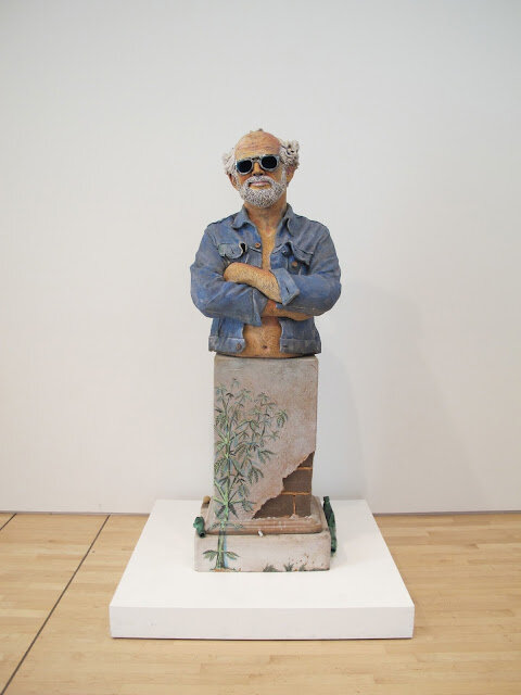
It is tough to be a regionalist (or simply rooted in your place) and be taken seriously by the east coast art establishment.  In visiting the SFMOMA the other day I was pleased to see Arneson's "California Artist" sculpture still prominently displayed.  The story behind this piece is revealing and there are strong parallels to events in the architecture scene over the years.  Often seen as anti-intellectual and preoccupied with craft, architecture and sculpture have had difficulty being recognized on the east coast.

But it is worth noting that many of the most convincing examples of sustainable architecture have emerged out of the far west where designs that were perhaps stylistically naive have been free to develop in a cultural climate that had the oxegon necessary to foster a pure esthetic of environment.  Sea Ranch and Peter Calthorpe buildings are two immediate examples that come to mind.  It is here where a desire to resonate strongly with the land - not just practically, but esthetically - helped establish a convincing toe hold for work that could unselfconsciously focus it's main thrust on issues of the environment without feeling it was a distraction from other more worthy causes.

Arneson's work is a rare but important example of an artist rooted in place, who was still capable of speaking to a more universal audience.  The provincial quality of some regional work is what gives it a bad name and Arneson transcends this convincingly.

Touring A Couple Oregon Prefab Factories by Michael Cobb


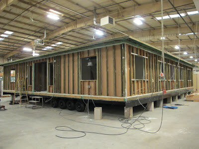
Several mods mocked up before shipping at the Blazer Industries Factory


In recent times I've noticed an uptick in people shopping custom home services in parallel with a modular solution. In an effort to address this burgeoning market, I decided to go up to Oregon to take a look at a few prefabrication plants.  At first blush the prefabrication industry seems fairly opaque and many traditional building contractors and designers are predictably suspicious of how the proverbial "sausage" gets made in a prefabrication facility.  It is not uncommon to hear stories about the less skilled labor associated with building in a factory and it is difficult to say how much of this is fact and how much is fiction.  Certainly, the less conspicuous manner in which a prefab building is executed away from the watchful eye of a client or a designer doesn't help this perception.  After this visit, I'm relieved to report this appears to not be the culture of the operations I visited.  Both outfits have established reputations delivering quality products to Bay Area clients the fabrication I witnessed was executed in an efficient manner.

The online prefabrication presence, on the other hand, can make it difficult to know if an outfit is designing the product or making the product. Equally unclear is the nature of the product. Is it something for which plans already exist or is a designer marketing an idea they are willing to put into working drawing form once there is a client?  Many people are speculating in this realm.  There is a lot of interesting conceptual stuff and not-so-interesting "fluffy" stuff to wade through.


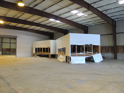
Fidelity Builder's factory. Two modules of a three module residence. 


In an effort to demystify this subject, I decided to visit Kevin Allen, of Fidelity Builders. While I was there I also visited the more established Blazer Industries company that Kevin worked for before starting Fidelity Builders. Both visits were very interesting. Kevin has a lot of experience building noteworthy homes for people in the bay area.  This  includes several Michelle Kaufmann homes while Kevin was at Blazer Industries. He is just starting his business so there wasn't a lot to see at his location. But for the same reason, people interested in doing new prefab homes would get great service if they used him. His overhead is low and he is passionate about what he's doing. This is always a great combination and people in the prefab design industry who have worked with him in the past have nothing but good things to say.

Some basic rules of thumb for would-be designers and installers:

  1. Keep it to 14' wide modules and you will be trapping all the efficiencies of the modular approach.
  2. If the house is coming into California you'll want to keep the overall height under 15'-7". This works out to be about a 12'-10" maximum modular height if one accounts for the trailer height. If you plan on the building being taller than this, plan on stacking things. 
  3. Once a modular building gets delivered it tends to be about half the cost of the project. The foundation and the utility hookups make up the lions share of the other half. 
  4. A price of $180 to $190 a square foot is a fairly common range for the modular component of a prefabricated structure.  
  5. Make sure you invest in a good foundation. Imprecisions in the foundation work can be costly to rectify.  Remember, the foundation and the infrastructure cost are the other significant piece of the price puzzle and can often work out to be as much as the mod itself.  The nature of modular construction requires a foundation that is, in all likelihood a bit more costly than a standard foundation because of the lower tolerances.
It is important to keep in mind that modular construction is not the same thing as conventional construction. There are built in inefficiencies and efficiencies. If you are building modularly keep the following in mind: The fewer seams the better. Everywhere there is a joint, there is site cost for two reasons:
  1. It is very easy to design something that will require the entire interior to be repainted after it is installed. This is especially true if the wall finishes are close to what one might expect in a nice residence. If you like a level V drywall finish I'm not sure I would bother having the factory do more than prime it. There will likely be substantial patching required after delivery. Compromising on wall finish quality is probably one of the biggest hurdles for the would-be prefab customer to overcome if they want to capture any efficiencies.
  2. Everywhere two modules meet there are typically two structural elements not one. For example, if two modules are side by side, there will likely be two walls up against each other. Equally, if you install a second floor module, there will likely be a separate floor and ceiling system

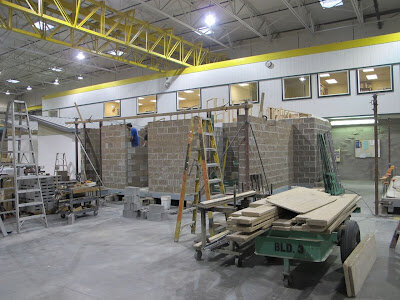
Building with masonry at Blazer Industries 

All in all I was very impressed with what I saw and heard. Blazer Industries, which handles more commercial projects, was clearly very capable.  If a project has an economy of scale that justifies a certain degree of complexity or is just very straightforward, they would be a great resource. I walked away from my visits feeling like there are reasons to go prefab that are compelling.  These have to do with quality control, managing expectations, shortening the construction period and minimizing waste. In the strictest sense, cost does not presently appear to be one of the explicit reasons to go modular in the custom home market. If you are willing to compromise sufficiently to produce a paradigm of efficiency, one could make a modular home that exploits these efficiencies. I'm skeptical, at this point, people are willing to do these things instinctively.  There are many historical examples that chronicle the typically-slow response of a society to exploit the efficiencies of a new way of building.  

Perhaps the most provocative reason to go prefab is a psychological one.  How often does a client want to change something midway through construction? These changes are often good ideas in theory but they are notoriously expensive in the middle of a project. In the traditional construction method, a good architect should make it clear to the client ahead of time how critical it is to avoid late changes.  But it can be difficult to persuade a client of this. "The customer is always right"is the credo that often governs and if there is additional income to be had by addressing this request, the architect will often capitulate to a client's request to modify the design against all better judgement.  Knowing when to capitulate on this sort of thing, is perhaps one of the bigger quandaries of a residential practice.  Prefabrication imposes a kind of "saving-you-from-yourself" discipline on a project that separates the pros from the amateurs because there is just more likelihood with a prefab solution that some site specific design element will get missed.  All parties need to thoroughly review the design before triggering fabrication.  This being said, if the architect is thorough and does a rigorous design, the economic pay off of avoiding design discovery on site is very promising.  

Demystifying Prefabrication by Michael Cobb


There is a lot to be confused about with prefabricated housing in California. Let's start with the terminology itself. If you talk with Codes and Standards Administrator, Kevin Cimini at the California Department of Housing and Community Development, you'll get a good explanation. There are basically two kinds of prefabrication.
  1. Manufactured Housing.  This what you find in mobile home parks here in California.  They are very standardized, regulated by federal HUD standards and designed very explicitly for affordability.  These units tend to depreciate in value reliably over time.
  2. Factory-Built Homes.  These buildings are regulated by the same California Building Code as any site built structure.  They are further subdivided into two distinct categories:
  • Orange Insignia Building Components.  In the custom home market, these components are usually individual rooms, combinations of rooms or entire dwelling units.
  • Red Insignia Building Components.  In the custom home market, these components are usually wall, floor and room panels.  Previous Agriboard and SIP panel projects done by Studio Ecesis were done using this delivery method.
A good way to remember the difference between these two color standards is that the "red" color appropriately alerts you to more required assembly on site.
When one reads about prefabrication in many popular design publications these days, it is important to realize the article is usually discussing orange insignia factory-built homes.  Produced by few, and promoted by many, these buildings are increasingly being conjured by architects and advertised on their websites.  The building itself is usually NOT produced by the architect but instead is reliant on a solid partnership between them and a handful of trustworthy factories that tend to aggregate - understandably - in areas that are more severely impacted by weather and its effects on the construction season.

Capilano Treetop Suspension Bridges by Michael Cobb

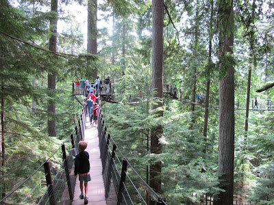
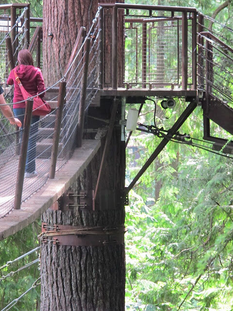
Another interesting destination in Vancouver is the Capilano Suspension Bridge Park.  Attaching tree houses successfully to trees is an age old endeavor fraught with challenges.  This park is visited by hundreds of thousands of guests every year and these tree houses are constructed without driving any fasteners into the  Douglas-fir trees!  If one reviews the myriad number of tree house books that exist out there one can appreciate how this is no small feat.  It is accomplished with a series of well placed adjustable girdles that also serve as attachment points for the suspension bridges.

There is also a really long suspension bridge across a river and a gravity defying cliff walk similar to the new one at the grand canyon.  Based on the photos I've seen of the one at the grand canyon, one might argue this cliff walk is better.  If you find yourself in North Vancouver, check it out.


An Imaginative Solution to a Common Grading Challenge. by Michael Cobb


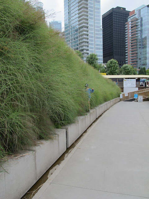
The Vancouver Convention Center has a number of interesting design features along its waterfront.  None of them catches the eye as much as this stabilized planting situation.  It was a wonderful way to deal with a grading condition that could have easily been a solved in a less inspired way using a concrete retaining wall.

Site Milling at Four Springs by Michael Cobb

Shawn working the portable sawmill
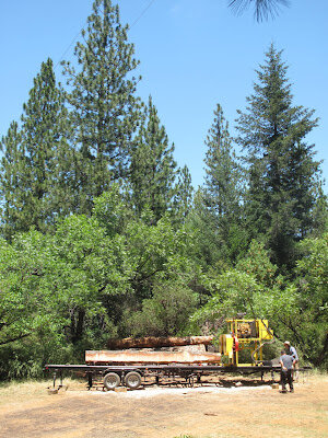
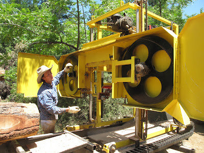
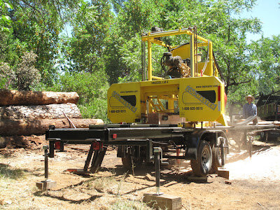
Shawn Gavin recently visited the Four Springs Property to mill a few trees (Douglas Fir and Pine) that were harvested from the site. My boys and I were able to visit him that day and had fun checking out his operation. 

Shawn fixing the bandsaw blade
  
Shawn has taken over the business from Merle Rueser. Merle did the Maidman Residence milling. As part of this new operation Shawn has a longer milling machine and can handle longer pieces of wood. This is always an issue with site milling since it is hard to have a portable sawmill that can rival the capacity of wood that is milled at a plant. According to Shawn this new mill also has a thinner blade than one often finds on mills and therefore is able to waste less wood in the cutting process. The new lodge is slated to have three debarked tree trunks as part of its entry experience. We were able to set aside three logs for this purpose while we were out there that day. 

The three entry porch columns
  
I heard one helper say "I don't think I've ever touched a board before that was so recently a tree." 

Cutting stickers for storing wood on site
 
It is wonderful when things get comprehensible like this. It reminds me of what organic food people appreciate about unprocessed food. I can't help but feel this is what is missing from the contemporary "green" building as it is popularly understood. A building that is good for the environment should be appreciated for more than an aggregation of "points." Preserving the causal connection between natural resources and a building's structural integrity is, to my mind, a symbolic and esthetic gesture that is worthy of preserving on many levels and does as much for the environment in a collective unconscious way as any excess of LEED points.


The Nature of Hillside Building in California by Michael Cobb

When I first left California to visit the midwest as a kid I missed the striking terrain and the interesting building forms this dynamic landscape generates.  Since a single level building is certainly one of the most efficient and/or practical building types, buildings made here are often, by practical necessity, outgrowths of our undulating terrain.


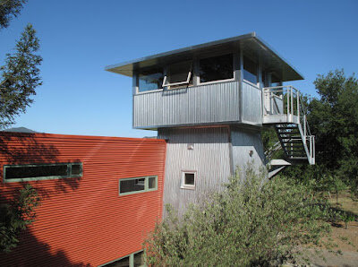
Several months ago we started designing the main lodge at the Four Springs Retreat Center.  The retreat is located on approximately 200 acres outside of Middletown in Lake County and most visitors stay in tiny cabins that have aggregated organically over the years on the sloping hillsides of this property.  The main lodge had burned down and they are rebuilding it.  When faced with the option of excavation or elevation, one finds that most of the cabins are elevated on wood stilts out over the hillside.  It is an esthetic born of practicality and simplicity that one finds all over this region.  One will find it in the Fitch Mountain cabins of Healdsburg, to the redwood cabins in the Monte Rio and Guerneville area along the lower Russian River Basin.

For economy, these structures often are built without a "skirt" because enclosing the area below the heated space is more costly than simply letting this understory area express the building's support system.  Conversely, in places like the Oakland hills, you tend to see this same zone enclosed.  Less costly solutions see this lower volume used for unheated storage while fully developed solutions use it for additional living space (particularly on small lots).

But at the Four Springs Retreat, where the land is wonderfully expansive, these inexpensive elevated buildings have a wonderful spindly charm that felt worthy of celebrating.    Single person sleeping quarters are vaguely nest-like.  Views from the windows of these cabins don't feature the root "flair" that exists at the base of tree trunks but instead present the tree canopies and pure cylindrical tree trunks.  The presence of a calm and still forest is everywhere.

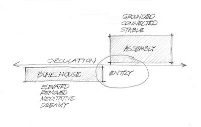
In creating an architecture of place, what is worthy of celebrating and what is deserving of the waste bin?  In a more airy discussion the relative merits of pluralism, "boom and bust" economics, beautiful nature, diverse religiosity and many other characteristics making up an abiding California character are worthy of scrutiny.  But the idea of elevated buildings and their relationship to the function of sleeping quarters was a subject seemingly broached by the site itself and gave flight to a building that ultimately had to reconcile two very different uses: assembly and sleeping.


"Z" Chair by Michael Cobb


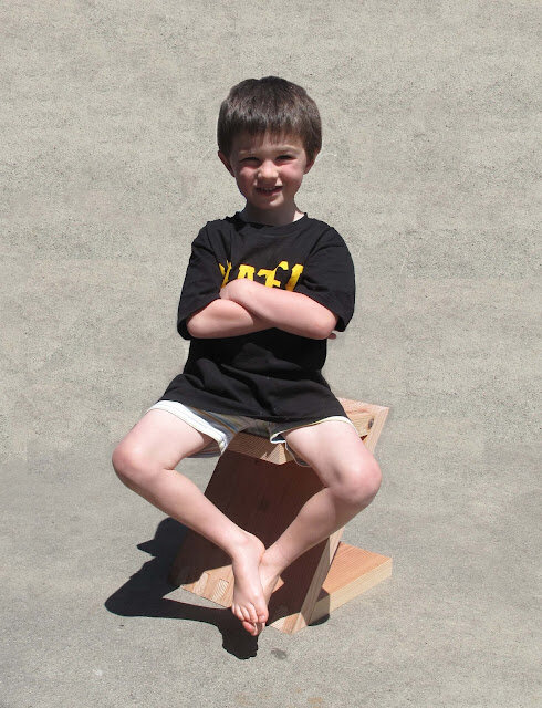
A recent side project at Studio Ecesis has been experimenting with connecting 2x framing lumber with large tongue and groove connections to sustain rigid folded joints.  The small piece featured here can work as an end table or a stool.

Douglas Fir is to the California building industry what rice is to Chinese cuisine.  Framing lumber, for example, can be used as a beam, a stud or a piece of blocking (see previous article for more on this).   If one is looking for a good wood window, one would be well served to dispense with the national norm of pine and go with a more local window company that uses our locally available Douglas Fir.  It is a stronger material and has a local chain of custody. Framing lumber is, of course, the main use for Doug Fir in California and, if you want an affordable building material, it is hard to beat.  This stool project was part of an ongoing attempt to come up with alternative uses for Douglas Fir as it is commonly provided us by the construction industry.

The pleasure of discovering these auxiliary applications to common building materials has a way of reverberating.  If you go to a residential job site these days and look at the scrap pile with a consciousness of reuse, your mouth will start to water.  In this way, the resource conservation problem, as it is popularly understood, is poorly framed.

The advertisements and articles in design magazines are interesting and the ferment in many ways is a positive thing but the complexity of the proposed solutions is often reminiscent of Heidegger's thoughts on windmills and hydro-electric power plants.  Simple is still good on many levels.


Certainly here in the far west we solve things with technology and there is no way technology will not be part of our solution.  Its just important to remember that obsolete technology is often ironically part of the problem.

To the side of this technological endeavor with all its plusses and minuses exists another way of looking at resource conservation.  Resource conservation can also be improved with simple imagination and a willingness to attempt beauty around the celebration of those resources we already possess.  This also needs to be part of any attempt to improve our environment.

Visit to an Oakland Food Pantry by Michael Cobb


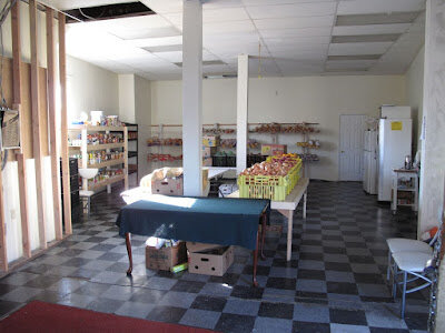
I recently had the opportunity to visit a Food Pantry that is doing a significant amount of good in West Oakland. It was compelling to see exactly what went into the successful distribution of food to the disadvantaged.  Greg Harland, the owner of the food pantry, is edifying an old building with the dual purpose of providing affordable housing and free food to the local community.  Stemming the intrusion of graffiti, stocking the food pantry with good affordable staples like potatoes and working toward upstairs functional apartments seem to be the ritual of building ownership for Greg.  Everything is done on a shoe string.    Surprisingly, one of the biggest challenges is to get a big enough truck to keep the pantry stocked.  Safeway and others are capable of providing a lot of food for the pantry.  But there is apparently only so much that can fit in a pickup truck.  It seems ironic that transportation and not the food itself would be the challenge.  It feels like an american problem.  

When I met Greg a few days back to check out his operation, the food pantry wasn't going to be open for an hour or so, but people were already lining up.  In the old days, this historic building had a covered walk way over the sidewalk.  This is something a modern day planning department would likely frown upon, but it is worth noting that for the lines that will be forming outside this building, the concept might be worthy of reintroducing.


Maidman Residence Nearing Completion by Michael Cobb


The client on this project needed to cut down a few large douglas fir trees to make room for a better septic system and to insure uphill trees did not one day fall on another residence.  It was an opportunity to make a strong project about resource conservation and the meaning and beauty manifest by natural resources repurposed on a single property.  These days, so many “green projects” are the opposite of this.  We are often told a material is “green” but the process of its creation is often highly engineered and complicated beyond any layman’s understanding (e.g. trex decking). 

Working with a hyper-local material seemed like a refreshing respite from the “mystery meat” of eco-materials on the market today. 

Every project has a narrative that gets told by the occupants. It can be a story of recycling, pure beauty or, like on this project, it can be a story of how the site gave to the house.  

The idea was simple:  First, we designed a building that highlighted the grandeur of the site's wood in the main space with large beams that could not be obtained affordably through more traditional lumberyard channels.  Anything over a 12" member tends to be special order at lumberyards and, after reviewing the size of the trees that were slated to be harvested, we went ahead and designed the space to work with 6x14 beams. Secondly, we planned for a consistent interior board finish that could be a convenient biproduct of the beam production and therefore minimize waste.  With this dual pronged approach, it was our intention to outfit the interior of this building with both a structural narrative and a visual majesty.   It felt meaningful to tell a story about the strength of this site both before and after the advent of this building.


It is a common american custom for a job to define an individual.  To know someone well we often ask them what they do. This holds quite true for objects as well despite the fact "doing" and "being" are a conflation of meanings.  What something is and what it does are different things.  Be that as it may, if one points at a log cabin and asks what it is, the proper response could be "wood" or "a house." In philosophy this is an ontological issue. The question speaks to the being, reality or existence of the thing.

These days, objects can be so highly processed we make very little connection between the object's materiality and the natural world. In the absence of knowing what something is made from, we have a natural tendency to fasten on the story of its making.  What was it made for?  What engineering process created it?  In the absence of a greater knowledge and interest in the material origins of things, we instead lay emphasis on the human project of its design and function.  One could even say we talk about the materiality of things now through the lens of our own ingenuity.  How much is the story of composite wood decking about wood and how much is it about the act of compositing and recycling materials or the advanced world of science that lies therein?

With the steady parade of contemporary green buildings our portrayal of the natural environment, and how we can go about protecting and honoring it, becomes quite skewed.  Exactly what constitutes a green material is often measured by how much highly processed salvaged work is involved in bringing an architectural product to the marketplace.  Countertops with recycled glass aggregate, insulation from old jeans or wood chips in composite decking are just a few of the products that fit this bill.   Few of us, when confronted with these products, could speak articulately about what they truly materially are.  

It begs the question:  If, on a gut level, we don't perceive our homes coming from any specific plants, trees or earth, how can we expect to truly care about the natural environment in the essential and visceral way that would insure their well being.  With the absence of this consciousness, don’t we have that much less perceived skin in the game?

As an American phenomenon, the green building movement has  parallels to the organic food movement.  Many scholars cite a major shift in the organic food movements when it "went industrial."   The word organic became more trivialized.  It often meant the simple practice of ingredient substitution.  If honey, for example, replaces corn syrup we consider the label of organic to be viable.  Deeper practices of making are neglected.


Similarly, on a typical green project the idea of substituting one classically unpopular material for a laudable green one is the popular device for achieving a credibly green project (e.g. a recycled green product might replace the use of wood).  

But it’s worth noting that reliable building materials that have been thoroughly vetted over time still endure.  This project is hopefully an example of this.  If it becomes necessary to remove trees for other reasons, the idea that one could use these same trees on site is a strategy worthy of examination.  The practice can contribute to the esthetics, the ecology and the economy of the project in a holistic and powerful way.  


Piper Street Residence: A Case for Fast-Tracking by Michael Cobb

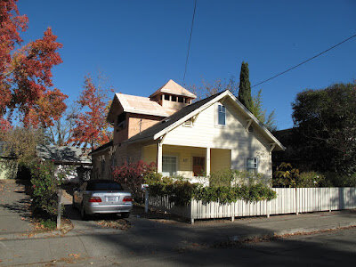
After

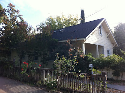
Before
A speedy small project is going up on Piper Street in downtown Healdsburg. This client visited Studio Ecesis in September and wanted to put a second story on their small, newly acquired, home before the rains came.  I was hesitant to take the job.  In addition to this difficult timeline there was the challenge of  making a diminutive Healdsburg bungalow into a successful two story structure.  So often when you try to expand a simple monumental gabled structure like these bungalows you wind up compromising the scale and significance of the front facade and entry.  

The headroom under the existing roof really precluded placing any kind of master bedroom in the attic without violating code requirements.  It was going to be necessary to raise the roof.

Cupola Framing Prior to Window Installation


To incorporate useful attic ventilation and bring light into the attic addition, a cupola "cooling chimney" was proposed for the center of the residence.  This also neutralized the dominant height of the new crossing gable since both gables were reduced to tributary elements to this central form.  

The client worked very quickly and we now have the framing in place.  Any storms now should be "tarp-able"and the crew can work throughout the winter.  It is important to realize this project was executed as a "shell package" for an experienced builder-client who understood the coordination issues that are still outstanding in the absence of a more complete set of documents.  Interior elevations prior to the commencement of construction are the usual norm and we elected to deal with these interior issues later due to the time crunch.

Jamb extensions, outlet locations, lighting, transition strips, finish build ups and a myriad of other interior work will be coordinated in situ.  Despite the ensuing delays on the interior work that will be associated with this lack of initial coordination, the client was able to get a roof on the project.  In this manner, they are able to work through the winter.  For anyone familiar with moving between homes, this "jump on the weather" can be an invaluable money saver despite the inefficiencies associated with this lack of initial document coordination.  

Many times a client will ask me to if they can start construction prior to the interior documents being complete.  My customary advice is to avoid this practice.  It is most often a penny wise and pound foolish approach where the client minimizes their initial design expenditure and winds up doing things twice or paying several subs to do head scratching in the field.  These are expensive solutions to something that could have been deliberately resolved on the drawing board before it ever became a "problem" in the field.  All of this to say that every project is different.  Here is an example of a project that deserved a fast-track approach because the carrying cost of another living circumstance outweighed the inefficiencies of a mere shell package at the outset.


The Sea Ranch Chapel - A Successful Use of Curves by Michael Cobb


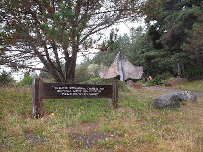
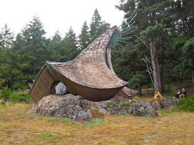
A visit out to the coast this weekend found me, my youngest son and a couple friends stopping by the Sea Ranch Chapel.  Over the years it has been fun to stop in at this place to marvel at the craftsmanship and see how the place is holding up.  All things considered it remains in remarkably good shape for such a unique structure, situated as it is only a few hundred yards off of highway 1 and a few hundred yards from the bluff.  Sculptor James Hubbell's design is commonly considered a successful collaboration between himself and craftsman Thamby Kumaran.  


One of the things that is most remarkable about this building is the way in which the organic curves of the building are accomplished so successfully and so smoothly.  So often, when architecture attempts to create an organic curve it is a lonely solo amongst a chorus of otherwise straight geometry.  This is usually all the budget can stomach.  Also, there is inevitably a "kink" or a "wobble" in the solitary geometry that calls the grace of the building (and its organic underpinnings) into question.  Curves are just hard to do convincingly and this building jumps in head first and reminds us that the flaws of a unified and riotous scheme are more easily obscured than when things are done in a timid or tentative manner.  A real place of beauty.